Plotting Functions
Plotting functions commonly required for geostatistical work have been wrapped within pygeostat. While most are coded with the intention of being plug and play, they can be used as a starting point and altered to your needs.
Please report any bugs, annoyances, or possible enhancements.
Introduction to Plotting with pygeostat
The following section introduces some thoughts on plotting figures and utility functions.
Figure Sizes
The CCG paper template margin allows for 6 inches of working width space, if two plots are to be put side by side, they would have to be no more than 3 inches. This is why many of the plotting functions have a default width of 3 inches.
The UofA’s minimum requirement for a thesis states that the left and right margins can not be less than 1 inch each. As the CCG paper template is the limiting factor, a maximum figure size of 3 inches is still a good guideline.
Fonts
The CCG paper template uses Calibri, figure text should be the same. The minimum font size for CCG papers is 8 pt.
The UofA’s minimum requirement for a thesis allows the user to select their own fonts keeping readability in mind.
If you are exporting postscript figures, some odd behavior may occur. Matplotlib needs to be
instructed which type of fonts to export with them, this is handled by using gs.set_style() which is within many of the plotting functions. The font
may also be called within the postscript file as a byte string, the function gs.exportimg() converts this into a working string.
You may find that when saving to a PDF document, the font you select is appearing bold. This happens
due to matplotlib using the same name for fonts within the same faimly. For example, if you specify
mpl.rcParams['font.family'] = 'Times New Roman' the bold and regular font may have the same name
causing the bold to be selected by default. A fix can be found here.
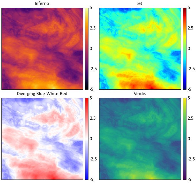
Selection of Colormaps and Colour Palettes
Continuous Colormaps
While the selection of colormaps may appear to based on personal preference, there are many factors that must be accounted for when selecting a colormap. Will your figures be viewed by colour blind individuals? Will the figure possibly be printed in black and white? Is the colormap perceived by our minds as intended?
See http://www.research.ibm.com/people/l/lloydt/color/color.HTM for a more in depth discussion on colormap theory.
Example
Which illustrates the most detail in the data? Spoiler: inferno does, in my opinion :) (Warren Black)
Colour theory research has shown that the colormap jet may appear detailed due to the colour differential; however, our perception of the colours distort the data’s representation. The blue-white-red colormap is diverging, therefore structure in the data is implied.
Diverging colormaps should only be used if the underlying structure is understood and needs special representation.
The inferno and viridis colormaps are sequential, are perceptually uniform, can be printed as black and white, and are accessible to colour blind viewers. Unfortunately, the inferno color map is some what jarring, therefore pygeostat’s default colormap is viridis as it is more pleasing. Both are not available as of version 1.5.1 in matplotlib. For more info check out http://bids.github.io/colormap/ and http://matplotlib.org/style_changes.html
Digital Elevation Models
There are two custom colormaps available through pygeostat for visualizing digital elevation models.
topo1 and topo2 are available through the
gs.get_cmap() function. They won’t look as pixelated as
the examples below…I promise!
topo1

topo2

Categorical Colour Palettes
There are three colour palettes available through pygeostat for visualizing categorical data.
cat_pastel and cat_vibrant consist of 12 colours, and the third, cat_dark, has 6
available colours. They are available through the gs.get_palette() function. Issues arise when trying to represent a large
number of categorical variables at once as colours will being to converge, meaning categories may
appear to be the same colour.
cat_pastel

cat_vibrant

cat_dark

Changing Figure Aesthetics
Matplotlib is highly customizable in that font sizes, line widths, and other styling options can all
be changed to the users desires. However, this process can be confusing due to the number of options.
Matplotlib sources these settings from a dictionary called mpl.rcParams. These can either be
changed within a python session or permanently within the matplotlibrc file. For more discussion on
mpl.rcParams and what each setting is, visit http://matplotlib.org/users/customizing.html
As a means of creating a standard, a base pre-set style is set within pygeostat ccgpaper and some variables of it. They are accessible through the function gs.set_style(). If you’d like to review their settings, the source can be easily viewed from this documentation. If users with to use their own defined mpl.rcParams, the influence of gs.set_style() can be easily turned off so the custom settings are honored, or custom settings can be set through gs.set_style(). Make sure to check out the functionality of
gs.gsPlotStyle().
Dealing with Memory Leaks from Plotting
As HDF5 functionality is enhanced within pygoestat (see gs.DataFile()), loading large datasets into memory will become a viable option. Some plotting functions are beginning updated to be able to handle these file types, such as gs.histpltsim(). If numerous plots are being generated in a loop, you may also notice that your systems physical memory is increasing without being dumped. This is a particular problem if large datasets are being loaded into memory.
Not sure as to the reason, but even if you reuse a name space, the old data attached to it is not removed until your systems memory is maxed out. Matplotlib also stores figures in a loop. The module gc has a function gc.collect() that will dump data not connected to a namespace in python.
The function gs.clrmplmem() dumps figure objects currently loaded and clears unused data from memory.
An example of its usage:
>>> pdfpages = '../99-Figures/hier/sim_NShistrep/0-Histrep.pdf'
>>> if not os.path.isfile(pdfpages) or overwrite:
>>>     pdfpages = PdfPages(pdfpages)
>>> else:
>>>     pdfpages = None
>>> for var in variables:
>>>     var = 'NS_'+var
>>>     simfl = '../03-Simulation/hier/sgsim_%s.h5' % var
>>>     outfl = '../99-Figures/hier/sim_NShistrep/%s_histrep.pdf' % var
>>>     ax = gs.histpltsim(refdat=syndat.data[var], simdat=simfl, griddef=griddef, pltstyle=False,
...                        outfl=outfl, out_kws={'pdfpages':pdfpages})
>>>     gs.clrmplmem()
>>> if pdfpages:
>>>     pdfpages.close()
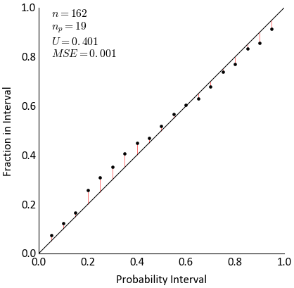
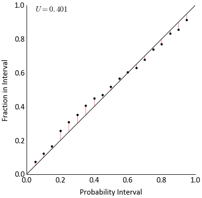
Accuracy Plot
-
pygeostat.plotting.accplt(x=None, y=None, truth=None, reals=None, mik_thresholds=None, acctype='sim', pinc=0.05, figsize=None, title=None, xlabel=None, ylabel=None, stat_blk='standard', stat_xy=(0.95, 0.05), stat_fontsize=None, ms=3.5, grid=None, axis_xy=None, ax=None, pltstyle=None, cust_style=None, outfl=None, **kwargs)¶ Currently, only the CCG program accplt-sim has been wrapped for use within pygeostat. All other accplt variations require the output summary file (i.e., ‘Width of Local Dists’ as
xand ‘Fraction in This Width’ asy).If you are not using the accplt-sim functionality built into pygeostat, the only parameters required are
xandy. When using the accplt-sim functionality built into pygeostat, the parameterstruthandrealsare required. The parameteracctypeis meaningless at this stage and is a place holder for future functionality.Two statistics block sets are available:
'minimal'and the default'standard'. The statistics block can be customized to a user defined list and order. Available statistics are as follows:>>> ['ndat', 'nint', 'avgvar', 'mse', 'acc', 'pre', 'goo']
When dealing with large datasets, loading data into python can be slow. Please review the documentation of
gs.DataFile()and the use of the argumentlower='gslib_f'or the use of HD5F files.Please review the documentation of the
gs.set_style()andgs.exportimg()functions for details on their parameters so that their use in this function can be understood.Keyword Arguments: - x – Tidy (long-form) 1D data where a single column containing values to plot along the x-axis. A pandas dataframe/series or numpy array can be passed
- y – Tidy (long-form) 1D data where a single column containing values to plot along the y-axis. A pandas dataframe/series or numpy array can be passed
- truth – Tidy (long-form) 1D data where a single column containing the true values. A pandas dataframe/series or numpy array can be passed
- reals – Tidy (long-form) 2D data where a single column contains values from a single realizations and each row contains the simulated values from a single truth location. A pandas dataframe or numpy matrix can be passed
- mik_thresholds (np.ndarray) – 1D array of the z-vals
mik_thresholdscorresponding to the probabilities defined in reals for each location - acctype (str) – Currently
simandmikare valid. ifmik_thresholdsis passed the type is assumed to bemik - pinc (float) – Probability increment used during accplt calculation
- figsize (tuple) – Figure size (width, height)
- title (str) – Title for the plot
- xlabel (str) – X-axis label
- ylabel (str) – Y-axis label
- stat_blk (bool) – Indicate if statistics are plotted or not
- stat_xy (float tuple) – X, Y coordinates of the annotated statistics in figure space. The coordinates specify the top right corner of the text block
- stat_fontsize (float) – the fontsize for the statistics block. If None, based on gsParams[‘plotting.stat_fontsize’]. If less than 1, it is the fraction of the matplotlib.rcParams[‘font.size’]. If greater than 1, it the absolute font size.
- ms (float) – Size of scatter plot markers
- grid (bool) – plots the major grid lines if True. Based on gsParams[‘plotting.grid’] if None.
- axis_xy (bool) – converts the axis to GSLIB-style axis visibility (only left and bottom visible) if axis_xy is True. Based on gsParams[‘plotting.axis_xy’] if None.
- ax (mpl.axis) – Matplotlib axis to plot the figure
- pltstyle (str) – Use a predefined set of matplotlib plotting parameters as specified by
gs.GridDef. UseFalseorNoneto turn it off - cust_style (dict) – Alter some of the predefined parameters in the
pltstyleselected. - outfl (str) – Output figure file name and location
- **kwargs – Optional permissible keyword arguments to pass to
gs.exportimg()
Returns: Matplotlib Axes object with the cross validation plot
Return type: ax (ax)
Examples
A simple call using x y data:
>>> gs.accplt(x=x, y=y)
A simple call using truth and realization data:
>>> gs.accplt(truth=truth, reals=reals)
A simple call using truth and realization data with a custom statistics block:
>>> gs.accplt(truth=truth, reals=reals, stat_blk=['avgvar'])
Code author: Warren E. Black - 2016-03-22, modified by Ryan M. Barnett - 2018-03-31
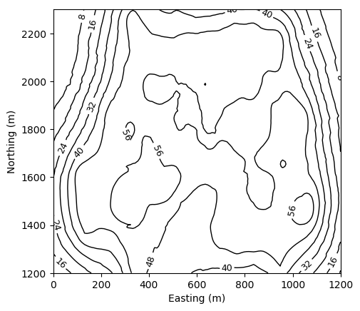
Contour Plot
-
pygeostat.plotting.contourplt(data, griddef=None, var=None, orient='xy', sliceno=0, ax=None, outfl=None, c='k', figsize=None, xlabel=None, ylabel=None, title=None, unit=None, leg_label=None, aspect=None, clabel=False, lw=1.0, pltstyle=None, cust_style=None, axis_xy=None, grid=None, return_ax=True, return_csi=False)¶ Contains a basic contour plotting routine using matplotlib reminiscent of pixelplt from gslib
Parameters: - data – A numpy ndarray, pandas DataFrame or pygeostat DataFile, where each column is a variable and each row is an observation
- griddef (GridDef) – A pygeostat GridDef class, which must be provided if a DataFile is
not passed as data with a valid internal
GridDef
gs.GridDef - var (str,int) – The name of the column within data to plot. If an int is provided, then it corresponds with the column number in data. If None, the first column of data is used.
- orient (str) – Orientation to slice data.
'xy','xz','yz'are the only accepted values - sliceno (int) – Grid cell location along the axis not plotted to take the slice of data to plot
- ax (mpl.axis) – Matplotlib axis to plot the figure
- outfl (str) – Output figure file name and location
- show (bool) –
Truewill use plt.show() at end. Typically don’t need this. - c (str) – Matplotlib color
- figsize (tuple) – Figure size (width, height)
- xlabel (str) – X-axis label
- ylabel (str) – Y-axis label
- title (str) – title for the plot
- unit (str) – Distance unit, taken from gsParams if
None - leg_label (str) – Adds a single label to the legend for the contour lines
- aspect (str) – Set a permissible aspect ratio of the image to pass to matplotlib.
- clabel (bool) – Whether or not to label the contours wth their values
- lw (float) – the weight of the contour lines
- pltstyle (str) – Optional pygeostat plotting style
- cust_style (dict) – Custom dictionary for plotting styles
- grid (bool) – Plots the major grid lines if True. Based on gsParams[‘plotting.grid’] if None.
- axis_xy (bool) – converts the axis to GSLIB-style axis visibility (only left and bottom visible) if axis_xy is True. Based on gsParams[‘plotting.axis_xy’] if None.
- return_ax (bool) – specify if the plotting axis should be returned
- return_csi (bool) – specify if the contour instance should be returned
Returns: Matplotlib ax.contour instance
Return type: csi (ax)
Examples:
A basic contour plotting example:
import pygeostat as gs
data = gs.ExampleData("grid2d_surf")
ax = gs.contourplt(data, var="Thickness", clabel=True)
Code author: Jared Deutsch 2015-05-21 and Ryan Barnett 2018-04-13
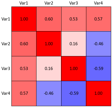
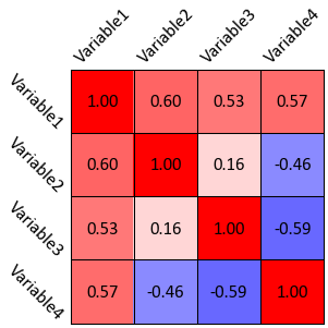
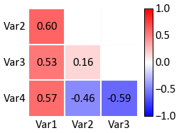
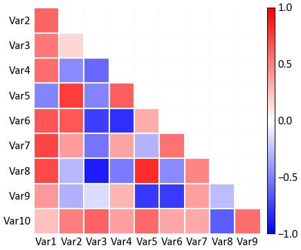
Correlation Matrix Plot
-
pygeostat.plotting.corrmat(corrmat_data, figsize=None, ax=None, cax=None, title=None, xticklabels=None, ticklabels=None, yticklabels=None, rotateticks=None, cbar=None, annot=None, lmat=False, lw=0.5, hierarchy=None, dendrogram=False, vlim=(-1, 1), cbar_label=None, cmap=None, pltstyle=None, cust_style=None, outfl=None, out_kws=None, sigfigs=3, **kwargs)¶ This function uses matplotlib to create a correlation matrix heatmap illustrating the correlation coefficient between each pair of variables.
The only parameter needed is the correlation matrix. All of the other arguments are optional. Figure size will likely have to be manually adjusted. If the label parameters are left to their default value of
Noneand the input matrix is contained in a pandas dataframe, the index/column information will be used to label the columns and rows. If a numpy array is passed, axis tick labels will need to be provided. Axis tick labels are automatically checked for overlap and if needed, are rotated. If rotation is necessary, consider condensing the variables names or plotting a larger figure as the result is odd. Ifcbaris left to its default value ofNone, a colorbar will only be plotted if thelmatis set to True. It can also be turned on or off manually. Ifannotis left to its default value ofNone, annotations will only be placed if a full matrix is being plotted. It can also be turned on or off manually.The parameter
ticklabelsis odd in that it can take a few forms, all of which are a tuple with the first value controlling the x-axis and second value controlling the y-axis (x, y). If left to its default ofNone, another pygeostat function will check to see if the labels overlap, if so it will rotate the axis labels by a default angle of (45, -45) if required. If a value ofTrueis pased for either axis, the respective default values previously stated is used. If either value is a float, that value is used to rotate the axis labels.The correlation matrix can be ordered based on hierarchical clustering. The following is a list of permissible arguments:
'single', 'complete', 'average', 'weighted', 'centroid', 'median',
'ward'
. The denrogram if plotted will have a height equal to 15% the height of the correlation matrix. This is currently hard coded.Please review the documentation of the
gs.set_style()andgs.exportimg()functions for details on their parameters so that their use in this function can be understood.Parameters: - corrmat_data – Pandas dataframe or numpy matrix containing the required loadings or correlation matrix
- figsize (tuple) – Figure size (width, height)
- ax (mpl.axis) – Matplotlib axis to plot the figure
- title (str) – Title for the plot
- ticklabels (list) – Tick labels for both axes
- xticklabels (list) – Tick labels along the x-axis (overwritten if ticklabels is passed)
- yticklabels (list) – Tick labels along the y-axis (overwritten if ticklabels is passed)
- rotateticks (bool or float tuple) – Bool or float values to control axis label rotations. See above for more info.
- cbar (bool) – Indicate if a colorbar should be plotted or not
- annot (bool) – Indicate if the cells should be annotated or not
- lmat (bool) – Indicate if only the lower matrix should be plotted
- lw (float) – Line width of lines in correlation matrix
- hierarchy (str) – Indicate the type of hieriarial clustering to use to reorder the correlation matrix. Please see above for more details
- dendrogram (bool) – Indicate if a dendrogram should be plotted. The argument
hierarchymust be set totruefor this argument to have any effect - vlim (tuple) – vlim for the data on the corrmat, default = (-1, 1)
- cbar_label (str) – string for the colorbar label
- cmap (str) – valid Matplotlib colormap
- pltstyle (str) – Use a predefined set of matplotlib plotting parameters as specified by
gs.GridDef. UseFalseorNoneto turn it off - cust_style (dict) – Alter some of the predefined parameters in the
pltstyleselected. - outfl (str) – Output figure file name and location
- out_kws (dict) – Optional dictionary of permissible keyword arguments to pass to
gs.exportimg() - sigfigs (int) – significant digits for labeling of colorbar and cells
- **kwargs – Optional permissible keyword arguments to pass to matplotlib’s pcolormesh function
Returns: matplotlib Axes object with the correlation matrix plot
Return type: ax (ax)
Examples
Calculate the correlation matrix varaibles in a pandas dataframe. In this case, there are 10 variables:
>>> corrmat = data.data.corr()
For illustration purposes, we’ll only look at the first 4 variables correlation matrix:
>>> temp_corrmat = corrmat.ix[:4, :4]
A simple call:
>>> gs.corrmat(temp_corrmat)
Again for illustration, convert the correlation dataframe into a numpy matrix. By using a numpy matrix, the axis labels will need to me manually entered. Reduce the figure size as well:
>>> varlabels = ['Variable1', 'Variable2', 'Variable3', 'Variable4']
>>> gs.corrmat(temp_corrmat.as_matrix(), figsize=(2, 2), ticklabels=varlabels)
Plotting a lower correlation matrix for a limited number of variables, while having annotations:
>>> gs.corrmat(temp_corrmat, figsize=(1.5, 1.5), lmat=True, annot=True)
Now lets use the full 10 variable correlation matrix, but only show the lower matrix:
>>> gs.corrmat(corrmat, lmat=True)
Code author: Warren E. Black - 2015-10-06
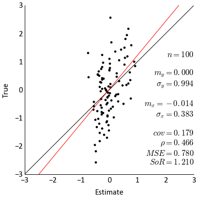
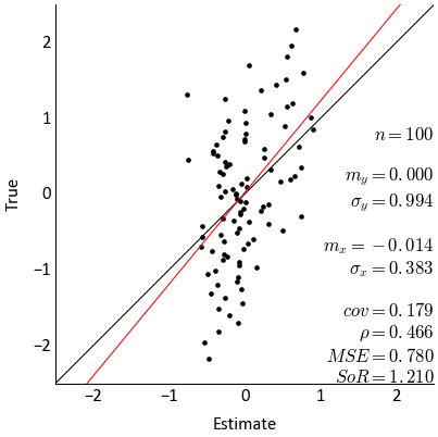
Cross-Validation Scatter Plot
-
pygeostat.plotting.scatxval(x, y, figsize=None, vlim=None, xlabel=None, ylabel=None, title=None, stat_blk='all', stat_xy=(0.95, 0.05), stat_ha=None, stat_fontsize=None, mc='k', ms=None, pltstyle=None, lw=None, grid=None, axis_xy=None, cust_style=None, outfl=None, ax=None, dens=False, rasterized=False, **kwargs)¶ This function uses numpy to calculate the regression model and matplotlibt to plot the scatter plot, regression line, and 45 degree line. Statistics are calculated using numpy.
The only parameters needed are the
xandy. All of the other arguments are optional. If the label parameters are left to their default value ofNone, the column information will be used to label the axes.Two statistics block sets are available:
'minimal'and the default'all'. The statistics block can be customized to a user defined list and order. Available statistics are as follows:>>> ['ndat', 'ymean', 'ystdev', 'xmean', 'xstdev', 'cov', 'rho', 'mse', 'sor']
Please review the documentation of the
gs.set_style()andgs.exportimg()functions for details on their parameters so that their use in this function can be understood.Parameters: - x – Tidy (long-form) 1D data where a single column of the variable to plot along the x-axis exists with each row is an observation. A pandas dataframe/series or numpy array can be passed.
- y – Tidy (long-form) 1D data where a single column of the variable to plot along the y-axis exists with each row is an observation. A pandas dataframe/series or numpy array can be passed.
- figsize (tuple) – Figure size (width, height)
- vlim (float tuple) – A single tuple for the minimum and maximum limits of data along both axes. Will not be a symmetrical plot if they are not the same value
- xlabel (str) – X-axis label
- ylabel (str) – Y-axis label
- title (str) – Title for the plot
- stat_blk (str or list) – Indicate what preset statistics block to write or a specific list
- stat_xy (str or float tuple) – X, Y coordinates of the annotated statistics in figure space.
- stat_ha (str) – Horizontal alignment parameter for the annotated statistics. Can be
'right','left', or'center'. The valueNonecan also be used to allow the parameterstat_xyto determine the alignment automatically. - stat_fontsize (float) – the fontsize for the statistics block. If None, based on gsParams[‘plotting.stat_fontsize’]. If less than 1, it is the fraction of the matplotlib.rcParams[‘font.size’]. If greater than 1, it the absolute font size.
- mc (str) – Any permissible matplotlib color value for the scatter plot markers
- ms (float) – Size of scatter plot markers
- grid (bool) – plots the major grid lines if True. Based on gsParams[‘plotting.grid’] if None.
- axis_xy (bool) – converts the axis to GSLIB-style axis visibility (only left and bottom visible) if axis_xy is True. Based on gsParams[‘plotting.axis_xy’] if None.
- pltstyle (str) – Use a predefined set of matplotlib plotting parameters as specified by
gs.GridDef. UseFalseorNoneto turn it off - cust_style (dict) – Alter some of the predefined parameters in the
pltstyleselected. - outfl (str) – Output figure file name and location
- **kwargs – Optional permissible keyword arguments to pass to
gs.exportimg()
Returns: Matplotlib Axes object with the cross validation plot
Return type: ax (ax)
Examples
A simple call:
>>> gs.scatxval(x=crossdat.data['Estimate'], y=crossdat.data['True'])
Fixing the value limits, moving the statistics block, and exporting the figure.
>>> gs.scatxval(x=crossdat.data['Estimate'], y=crossdat.data['True'], vlim=(-3, 3),
...             stat_xy=(1, 0.68), outfl='./figures/scatxval', fltype='png)
Code author: Warren E. Black - 2015-08-05
Drill Plot
-
pygeostat.plotting.drillplt.drillplt(data, dhid=None, x=None, y=None, z=None, var=None, plt_collar=True, collar_offset=0, griddef=None, orient='xz', sliceno=None, slicetol=None, ax=None, figsize=None, xlim=None, ylim=None, vlim=None, linewidth=3, s=20, marker='x', title=None, xlabel=None, ylabel=None, unit=None, rotateticks=None, cbar=True, sigfigs=3, cmap=None, grid=None, axis_xy=None, aspect='equal', pltstyle=None, cust_style=None, outfl=None, out_kws=None, return_cbar=False, **kwargs)¶ Drillplt displays a line plot for each drill hole based off of the drill hole ID.
The only required parameter is
dataif it is ags.DataFilethat contains the necessary coordinate column headers, data, and if required, a pointer to a validgs.GridDefclass. All other parameters are optional however if you want the drilles colored than a variable column name needs to also be passed. Ifdatais ags.DataFileclass and does not contain all the required parameters or if it is a long-form table, the following parameters will need to be passed:x,y,z, andgriddef. The three coordinate parameters may not be needed depending on whatorientis set to and of course if the dataset is 2-D or 3-D. The parametergriddefis required ifslicetolor `` sliceno`` is used. If parameterslicenoandslicetolis not set then the default slice tolerance is half the cell width. If a negativeslicetolis passed or sliceno is set to None then all data will be plotted.slicetolis based on coordinate units.The values used to bound the data (i.e., vmin and vmax) are automatically calculated by default. These values are determined based on the number of significant figures and the sliced data; depending on data and the precision specified, scientific notation may be used for the colorbar tick lables.
Please review the documentation of the
gs.set_style()andgs.exportimg()functions for details on their parameters so that their use in this function can be understood.Parameters: - data – Tidy (long-form) dataframe where each column is a variable and each row is an
observation. Pandas dataframe or numpy array or a
gs.DataFileclass - x (str) – Column header of x-coordinate. Required if the conditions discussed above are not met
- y (str) – Column header of y-coordinate. Required if the conditions discussed above are not met
- z (str) – Column header of z-coordinate. Required if the conditions discussed above are not met
- var (str) – Column header of variable to coloring segments with or a permissible matplotlib colour
- griddef (GridDef) – A pygeostat GridDef class created using
gs.GridDef. Required if using the argumentslicetol - orient (str) – Orientation to slice data.
'xy','xz','yz'are the only accepted values - sliceno (int) – Grid cell location along the axis not plotted to take the slice of data to plot. None will plot all data
- slicetol (float) – Slice tolerance to plot point data (i.e. plot +/-
slicetolfrom the center of the slice). Any negative value plots all data. Requiressliceno. If aslicenois passed and noslicetolis set, then the default will half the cell width based on the griddef. - ax (mpl.axis) – Matplotlib axis to plot the figure
- figsize (tuple) – Figure size (width, height)
- xlim (float tuple) – X-axis limits
- ylim (float tuple) – Y-axis limits
- vlim (float tuple) – Data minimum and maximum values
- linewidth (float) – Linewidth for drawing the drill holes
- title (str) – Title for the plot. If left to it’s default value of
Noneor is set toTrue, a logical default title will be generated for 3-D data. Set toFalseif no title is desired. - xlabel (str) – X-axis label
- yalabl (str) – Y-axis label
- unit (str) – Unit to place inside the axis label parentheses
- rotateticks (bool tuple) – Indicate if the axis tick labels should be rotated (x, y)
- cbar (bool) – Indicate if a colorbar should be plotted or not
- sigfigs (int) – Number of sigfigs to consider for the colorbar
- cmap (str) – Permiciable matplotlib or colormap or pygeostat palette
- aspect (str) – Set a permissible aspect ratio of the image to pass to matplotlib.
- grid (bool) – Plots the major grid lines if True. Based on gsParams[‘plotting.grid’] if None.
- axis_xy (bool) – converts the axis to GSLIB-style axis visibility (only left and bottom visible) if axis_xy is True. Based on gsParams[‘plotting.axis_xy’] if None.
- aspect – Set a permissible aspect ratio of the image to pass to matplotlib.
- pltstyle (str) – Use a predefined set of matplotlib plotting parameters as specified by
gs.GridDef. UseFalseorNoneto turn it off - cust_style (dict) – Alter some of the predefined parameters in the
pltstyleselected. - outfl (str) – Output figure file name and location
- out_kws (dict) – Optional dictionary of permissible keyword arguments to pass to
gs.exportimg() - return_cbar (bool) – Indicate if the colorbar axis should be returned
- **kwargs – Optional permissible keyword arguments to pass to matplotlib’s imshow function
Returns: Matplotlib axis instance which contains the gridded figure
Return type: ax (ax)
Returns: Optional, default False. Matplotlib colorbar object
Return type: cbar (cbar)
Examples
A simple plot using the oilsands example data set:
>>> gs.drillplt(drillholes, var='Bitumen', plt_collar=False, aspect=10, figsize=(6,3))
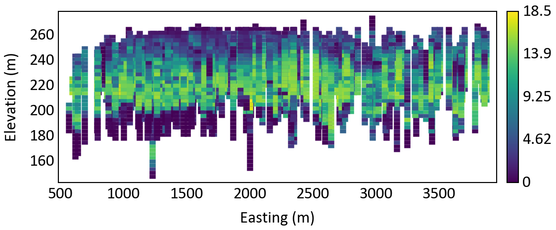
Plotting a slice of the oilsands drill hole data based on a griddef and a slice tolerance
>>> gs.drillplt(drillholes, var='Bitumen', plt_collar=False, aspect=10, figsize=(6,3),
...             orient='xz', griddef=grid, sliceno=10, slicetol=10)
Code author: Tyler Acorn - 2016-04-08
- data – Tidy (long-form) dataframe where each column is a variable and each row is an
observation. Pandas dataframe or numpy array or a
Exporting Figures
-
pygeostat.plotting.exportimg(outfl=None, fltype=None, pad=0.03, dpi=300, custom=None, pdfpages=None, delim=None, Metadata=True, **kwargs)¶ This function exports a figure with the specified file name and type(s) to the specified location. Multiple file types can be exported at once. Avoids the use of plt.tight_layout() which can behave odd and minimizes whitespace on the edge of figures.
Note
This function is typically called within plotting functions but can be used on its own.
Extensions are not required in the
outflargument. They will be added according to whatfltypeis set to. The default output file types are png and eps. However, if extensions are provided, they will be used, provided that the argumentfltypeis not passed. Thecustomargument provides extra flexibility if the default settings of this function are not desired. If thecustomfunctionality is the only desired output,fltypecan be set toFalseto prevent additional exports.PS and EPS files need to have their font definitions fixed so that they will be called properly which is done automatically if they are used.
Figures can also be appended to an existing
mpl.backends.backend_pdf.PdfPagesobject passed with thepdfpagesargument. These objects are used to created multi-page PDF documents.Parameters: - outfl (str or list) – Details the file location and file name in one parameter or a list of
files to export with or without file extensions. If not file extensions are provided,
the parameter
fltypewill need to be specified if its defaults are not desired - fltype (str, list, bool) – The file extension or list of extensions. See plt.savefig() docs
for which file types are supported. Can set to
Falseto prevent normal functionality whencustomsettings are the only desired output. - pad (float) – The amount of padding around the figure
- dpi (int) – The output file resolution
- custom (dict) – Indicates a custom dpi and file extension if an odd assortment of files are needed
- pdfpages (mpl.object) – A multi-page PDF file object created by
mpl.backends.backend_pdf.PdfPages. If a PdfPages object is passed, the figure is exported to it in addition to the other files if specified. Use this method to generate PDF files with multiple pages. - delim (str) – delimiter in the outfl str passes that indicates different types of files. set to None to ensure filenames with spaces can be used.
- kwargs – Any other permissible keyword arguments to send to plt.savefig() (e.g., )
Examples
A simple call using the default settings exporting two images at 300 dpi:
>>> gs.exportimg(outfl='../Figures/histplt')
    'histplt.png' and 'histplt.eps' are exported
A call specifying only a png file and altering the dpi setting and setting the background to transparent (via **kwargs):
>>> gs.exportimg(outfl='../Figures/histplt.png', dpi=250, transparent=True)
    'histplt.png' is exported in '../Figures/'
A call using only the custom argument:
>>> gs.exportimg(outfl='../Figures/histplt', fltype=False, custom={600:'png', 200:'png'})
    'histplt_600.png' and 'histplt_200.png' are exported in '../Figures/'
A call using a combination of arguments:
>>> gs.exportimg(outfl='../Figures/histplt', custom={600:'jpg'})
    'histplt.png' and 'histplt.eps' at 300 dip in addition to histplt_600.jpg' are exported
    in '../Figures/'
A call using a more complicated combination of arguments:
>>> gs.exportimg(outfl=['../Figures/png/histplt', '../Figures/eps/histplt'],
...              custom={600:'png'})
    'histplt.png' @ 300 dpi and 'histplt_600.png' @ 600 dpi are placed in '../Figures/png/'
    while 'histplt.eps' is placed in '../Figures/eps/'
Create a PDFPages matplotlib object and save the figure to it:
>>> from matplotlib.backends.backend_pdf import PdfPages
>>> pdfpages = PdfPages('outfl.pdf')
>>> plt. # Generate figure
>>> gs.exportimg(pdfpages=pdfpages)
>>> pdfpages.close()
Code author: Warren E. Black - 2015-10-22
- outfl (str or list) – Details the file location and file name in one parameter or a list of
files to export with or without file extensions. If not file extensions are provided,
the parameter
Histogram Plot
-
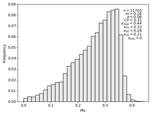
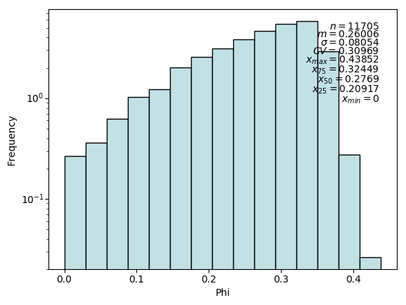
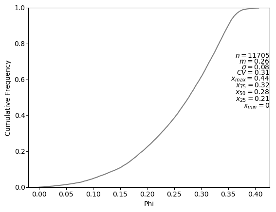
pygeostat.plotting.histplt(data, var=None, wt=None, cat=None, catdict=None, bins=None, icdf=False, lower=None, upper=None, ax=None, figsize=None, xlim=None, ylim=None, title=None, xlabel=None, stat_blk=None, stat_xy=None, stat_ha=None, roundstats=None, sigfigs=None, color=None, edgecolor=None, edgeweight=None, grid=None, axis_xy=None, lblcount=False, rotateticks=None, pltstyle=None, cust_style=None, outfl=None, out_kws=None, stat_fontsize=None, stat_linespc=0.8, **kwargs)¶ Generates a matplotlib style histogram with summary statistics. Trimming is now only applied to NaN values (Pygeostat null standard).
The only required required parameter is
data. Ifxlabelis left to its default value ofNoneand the input data is contained in a pandas dataframe or series, the column information will be used to label the x-axis.Two statistics block sets are available:
'all'and the default'minimal'. The statistics block can be customized to a user defined list and order. Available statistics are as follows:>>> ['count', 'mean', 'stdev', 'cvar', 'max', 'upquart', 'median', 'lowquart', 'min', ... 'p10', 'p90']
The way in which the values within the statistics block are rounded and displayed can be controlled using the parameters
roundstatsandsigfigs.Please review the documentation of the
gs.set_style()andgs.exportimg()functions for details on their parameters so that their use in this function can be understood.Parameters: - data (np.ndarray, pd.DataFrame/Series, or gs.DataFile) – data array, which must be 1D unless var is provided. The exception being a DataFile, if data.variables is a single name.
- var (str) – name of the variable in data, which is required if data is not 1D.
- wt (np.ndarray, pd.DataFrame/Series, or gs.DataFile or str) – 1D array of declustering weights for the data. Alternatively the declustering weight name in var. If data is a DataFile, it may be string in data.columns, or True to use data.wt (if data.wt is not None).
- cat (bool or str) – either a cat column in data.data, or if True uses data.cat if data.cat is not None
- catdict (dict or bool) – overrides bins. If a categorical variable is being plotted, provide a dictionary where keys are numeric (categorical codes) and values are their associated labels (categorical names). The bins will be set so that the left edge (and associated label) of each bar is inclusive to each category. May also be set to True, if data is a DataFile and data.catdict is initialized.
- bins (int or list) – Number of bins to use, or a list of bins
- icdf (bool) – Indicator to plot a CDF or not
- lower (float) – Lower limit for histogram
- upper (float) – Upper limit for histogram
- ax (mpl.axis) – Matplotlib axis to plot the figure
- figsize (tuple) – Figure size (width, height)
- xlim (float tuple) – Minimum and maximum limits of data along the x axis
- ylim (float tuple) – Minimum and maximum limits of data along the y axis
- title (str) – Title for the plot
- xlabel (str) – X-axis label
- stat_blk (bool) – Indicate if statistics are plotted or not
- stat_xy (float tuple) – X, Y coordinates of the annotated statistics in figure space. Based on gsParams[‘plotting.histplt.stat_xy’] if a histogram and gsParams[‘plotting.histplt.stat_xy’] if a CDF, which defaults to the top right when a PDF is plotted and the bottom right if a CDF is plotted.
- stat_ha (str) – Horizontal alignment parameter for the annotated statistics. Can be
'right','left', or'center'. If None, based on gsParams[‘plotting.stat_ha’] - stat_fontsize (float) – the fontsize for the statistics block. If None, based on gsParams[‘plotting.stat_fontsize’]. If less than 1, it is the fraction of the matplotlib.rcParams[‘font.size’]. If greater than 1, it the absolute font size.
- roundstats (bool) – Indicate if the statistics should be rounded to the number of digits or
to a number of significant figures (e.g., 0.000 vs. 1.14e-5). The number of digits or
figures used is set by the parameter
sigfigs. sigfigs (int): Number of significant figures or number of digits (depending onroundstats) to display for the float statistics - color (str or int or dict) – Any permissible matplotlib color or a integer which is used to draw
a color from the pygeostat color pallet
pallet_pastel> May also be a dictionary of colors, which are used for each bar (useful for categories). colors.keys() must align with bins[:-1] if a dictionary is passed. Drawn from gsParams[‘plotting.cmap_cat’] if catdict is used and their keys align. - edgecolor (str) – Any permissible matplotlib color for the edge of a histogram bar
- grid (bool) – plots the major grid lines if True. Based on gsParams[‘plotting.grid’] if None.
- axis_xy (bool) – converts the axis to GSLIB-style axis visibility (only left and bottom visible) if axis_xy is True. Based on gsParams[‘plotting.axis_xy’] if None.
- lblcount (bool) – label the number of samples found for each category in catdict. Does nothing if no catdict is found
- rotateticks (bool tuple) – Indicate if the axis tick labels should be rotated (x, y)
- pltstyle (str) – Use a predefined set of matplotlib plotting parameters as specified by
gs.GridDef. UseFalseorNoneto turn it off - cust_style (dict) – Alter some of the predefined parameters in the
pltstyleselected. - outfl (str) – Output figure file name and location
- out_kws (dict) – Optional dictionary of permissible keyword arguments to pass to
gs.exportimg() - **kwargs – Optional permissible keyword arguments to pass to either: (1) matplotlib’s hist function if a PDF is plotted or (2) matplotlib’s plot function if a CDF is plotted.
Returns: matplotlib Axes object with the histogram
Return type: ax (ax)
Examples:
A simple call:
import pygeostat as gs
# load some data
dfl = gs.ExampleData("point3d_ind_mv")
# plot the histplt
gs.histplt(dfl, var="Phi", bins=30)
Change the colour, number of significant figures displayed in the statistics, and pass some keyword arguments to matplotlibs hist function:
import pygeostat as gs
# load some data
dfl = gs.ExampleData("point3d_ind_mv")
# plot the histplt
gs.histplt(dfl, var="Phi", color='#c2e1e5', sigfigs=5, log=True, density=True)
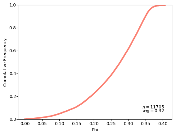
Plot a CDF while also displaying all available statistics, which have been shifted up:
import pygeostat as gs
# load some data
dfl = gs.ExampleData("point3d_ind_mv")
# plot the histplt
gs.histplt(dfl, var="Phi", icdf=True, stat_blk='all', stat_xy=(1, 0.75))
# Change the CDF line colour by grabbing the 3rd colour from the color pallet
# ``cat_vibrant`` and increase its width by passing a keyword argument to matplotlib's
# plot function. Also define a custom statistics block:
gs.histplt(dfl, var="Phi", icdf=True, color=3, lw=3.5, stat_blk=['count','upquart'])
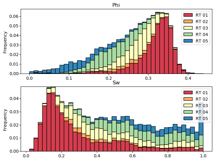
Generate histograms of Phi considering the categories:
import pygeostat as gs
# load some data
dfl = gs.ExampleData("point3d_ind_mv")
cats = [1, 2, 3, 4, 5]
colors = gs.catcmapfromcontinuous("Spectral", 5).colors
# build the required cat dictionaries
dfl.catdict = {c: "RT {:02d}".format(c) for c in cats}
colordict =  {c: colors[i] for i, c in enumerate(cats)}
# plot the histplt
f, axs = plt.subplots(2, 1, figsize=(8, 6))
for var, ax in zip(["Phi", "Sw"], axs):
    gs.histplt(dfl, var=var, cat=True, color=colordict, bins=40, figsize=(8, 4), ax=ax,
               xlabel=False, title=var)
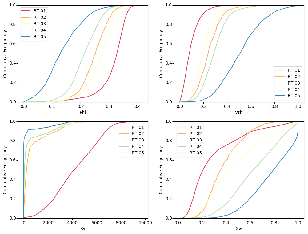
Generate cdf subplots considering the categories:
import pygeostat as gs
# load some data
dfl = gs.ExampleData("point3d_ind_mv")
cats = [1, 2, 3, 4, 5]
colors = gs.catcmapfromcontinuous("Spectral", 5).colors
# build the required cat dictionaries
dfl.catdict = {c: "RT {:02d}".format(c) for c in cats}
colordict =  {c: colors[i] for i, c in enumerate(cats)}
# plot the histplt
f, axs = plt.subplots(2, 2, figsize=(12, 9))
axs=axs.flatten()
for var, ax in zip(dfl.variables, axs):
    gs.histplt(dfl, var=var, icdf=True, cat=True, color=colordict, ax=ax)
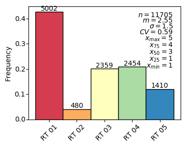
Recreate the Proportion class plot
import pygeostat as gs
# load some data
dfl = gs.ExampleData("point3d_ind_mv")
cats = [1, 2, 3, 4, 5]
colors = gs.catcmapfromcontinuous("Spectral", 5).colors
# build the required cat dictionaries
dfl.catdict = {c: "RT {:02d}".format(c) for c in cats}
colordict =  {c: colors[i] for i, c in enumerate(cats)}
# plot the histplt
ax = gs.histplt(dfl, cat=True, color=colordict, figsize=(4, 3), rotateticks=(45, 0),
                lblcount=True)
Code author: Matthew Deutsch, Jared Deutsch, and Warren E. Black - 2015-10-13
Histogram Reproduction Plot
-
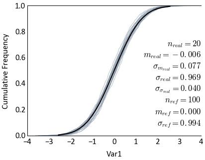
pygeostat.plotting.histpltsim(simdat, refdat, refvar=None, refwt=None, ref_ndat=None, simvar=None, griddef=None, sim_fltype='gslib_f', nreal=None, nsub=None, svalue_lims=False, ax=None, figsize=None, xlim=None, title=None, xlabel=None, stat_blk='all', stat_xy=(0.95, 0.05), refclr=None, simclr=None, alpha=None, lw=1, pltstyle=None, cust_style=None, outfl=None, out_kws=None, sim_kws=None, **kwargs)¶ histpltsim emulates the GSLIB histpltsim program as a means of checking histogram reproduction of simulated realizations to the original histogram. Large realizations can be sub-sampled using a FORTRAN subroutine wrapped for python. The use of python generators is a very flexible and easy means of instructing this plotting function as to what to plot.
The function accepts five types of simulated input passed to the
simdatargument:- 1-D array like data (numpy or pandas) containing 1 or more realizations of simulated data.
- 2-D array like data (numpy or pandas) with each column being a realization and each row being an observation.
- List containing location(s) of realization file(s).
- String containing the location of a folder containing realization files. All files in the folder are read in this case.Can contain
- String with a wild card search(s) (e.g., ‘./data/sgsim_real_*.out’)
- Python generator object that yields a 1-D numpy array.
The function accepts two types of reference input passed to the
refdatargument:- Array like data containing the reference variable
- String containing the location of the reference data file (e.g., ‘./data/data.out’)
This function uses pygeostat for plotting and numpy to calculate statistics.
The only parameters required are
refdatandsimdat. If files are to be read or a 1-D array is passed, the parametersgriddefandnrealare required.simvaris required for reading files as well. It is assumed that an equal number of realizations are within each file if multiple file locations are passed. Sub-sampling of datafiles can be completed by passing the parameternsub. If a file location is passed torefdat, the parametersrefvarandref_ndatare required. All other arguments are optional or determined automatically if left at their default values. Ifxlabelis left to its default value ofNone, the column information will be used to label the axes if present. Three keyword dictionaries can be defined. (1)sim_kwswill be passed to pygeostat histplt used for plotting realizations (2)out_kwswill be passed to the pygeostat exportfig function and (3)**kwargswill be passed to the pygeostat histplt used to plot the reference data.Two statistics block sets are available:
'minimal'and the default'all'. The statistics block can be customized to a user defined list and order. Available statistics are as follows:>>> ['nreal', 'realavg', 'realavgstd', 'realstd', 'realstdstd', 'ndat', 'refavg', 'refstd']
Please review the documentation of the
gs.set_style()andgs.exportimg()functions for details on their parameters so that their use in this function can be understood.Parameters: - simdat – Input simulation data
- refdat – Input reference data
Keyword Arguments: - refvar (int, str) – Required if sub-sampling reference data. The column containing the data to be sub-sampled
- refwt – 1D dataframe, series, or numpy array of declustering weights for the data. Can also be a string of the column in the refdat if refdat is a string, or a bool if refdat.wts is a string
- ref_ndat (int) – Required if sub-sampling reference data. The number of data within the reference data file to sample from
- griddef (GridDef) – A pygeostat class GridDef created using
gs.GridDef - simvar (int) – Required if sub-sampling simulation data. The column containing the data to be sub-sampled
- nreal (int) – Required if sub-sampling simulation data. The total number of realizations
that are being plotted. If a HDF5 file is passed, this parameter can be used to limit
the amount of realizations plotted (i.e., the first
nrealrealizations) - nsub (int) – Required if sub-sampling is used. The number of sub-samples to draw.
- ax (mpl.axis) – Matplotlib axis to plot the figure
- figsize (tuple) – Figure size (width, height)
- xlim (float tubple) – Minimum and maximum limits of data along the x axis
- title (str) – Title for the plot
- xlabel (str) – X-axis label
- stat_blk (str or list) – Indicate what preset statistics block to write or a specific list
- stat_xy (str or float tuple) – X, Y coordinates of the annotated statistics in figure space. The default coordinates specify the bottom right corner of the text block
- refclr (str) – Colour of original histogram
- simclr (str) – Colour of simulation histograms
- alpha (float) – Transparency for realization variograms (0 = Transparent, 1 = Opaque)
- lw (float) – Line width in points. The width provided in this parameter is used for the reference variogram, half of the value is used for the realization variograms.
- pltstyle (str) – Use a predefined set of matplotlib plotting parameters as specified by
gs.GridDef. UseFalseorNoneto turn it off - cust_style (dict) – Alter some of the predefined parameters in the
pltstyleselected - outfl (str) – Output figure file name and location
- out_kws (dict) – Optional dictionary of permissible keyword arguments to pass to
gs.exportimg() - sim_kws – Optional dictionary of permissible keyword arguments to pass to
gs.histplt()for plotting realization histograms and by extension, matplotlib’s plot function if the keyword passed is not used bygs.histplt() - **kwargs – Optional dictionary of permissible keyword arguments to pass to
gs.histplt()for plotting the reference histogram and by extension, matplotlib’s plot function if the keyword passed is not used bygs.histplt()
Returns: matplotlib Axes object with the histogram reproduction plot
Return type: ax (ax)
Examples
A simple call passing the simdat and refdat data as pandas series:
>>> gs.histpltsim(simdat=simdat.data['Var1'], refdat=refdat.data['Var1'])
Moving the statistics block and changing the line width of the histograms:
>>> gs.histpltsim(simdat=simdat.data['Var1'], refdat=refdat.data['Var1'],
...               stat_xy=(1, 0.73), lw=0.5)
Permissible simdat arguments that don’t pass dataframe or numpy data are as follows:
String or list containing location(s) of realization file(s)
- simdat = ‘../simdat/sgsim.out’
- simdat = [‘../simdat/sgsim_001.out’,…,’../simdat/sgsim_100.out’]
2. String containing the location of a folder containing realization files with a wild card search to locate the required files.
- simdat = ‘../simdat/*’
- simdat = ‘../simdat/sgsim_*.out’
Using one of the argument methods above, histpltsim could be called with sub-sampling using:
>>> gs.histpltsim(simdat=simdat, refdat=refdat.data['var'], griddef=griddef, simvar=1,
...               nreal=100, nsub=5000)
The above case passes pandas or numpy reference data to the. If a string containing the location of a data file was passed instead, histpltsim could be called using:
>>> gs.histpltsim(simdat=simdat, refdat='../data/inputdat.out', griddef=griddef, simvar=1,
...               nreal=100, refvar=1, ref_ndat=40000, nsub=5000)
Alternatively, python generators can be created and passed to the plotting function:
>>> # Load all datasets with the string "Real" from the same group in an HDF5 file
>>> h5dat = gs.H5Store('./sgsim.h5')
>>> simdat = h5dat.iteritems(wildcard="Real")
>>>
>>> # Pass the generator to addsimdatfl
>>> gs.histpltsim(simdat=simdat, refdat=refdat.data['Var1'])
>>> # Load a variables realizations from separate realization files
>>> def iter_simreals():
>>>     for ireal in range(100):
>>>         simfl = './real_%s.h5' % ireal
>>>         data = gs.H5Store(simfl)
>>>         yeild data['NS_AU']
>>>
>>> # Pass the generator to addsimdatfl
>>> gs.histpltsim(simdat=iter_simreals(), refdat=refdat.data['NS_AU'])
Code author: Warren E. Black - 2016-07-25
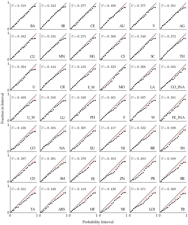
Image Grid Plotter
-
pygeostat.plotting.imagegrid.imagegrid(symmetric=False, nvar=None, ncol=None, nrow=None, gridfunc=None, upperfunc=None, lowerfunc=None, diagfunc=None, tight=False, axes_pad=0.2, cbar=False, vlim=None, cbar_label=None, figsize=None, aspect=None, xlim=None, ylim=None, axislabels=None, xlabel=None, ylabel=None, suptitle=None, ntickbins=2, rotateticks=False, pltstyle=None, cust_style=None, outfl=None, labelmode='all', unequal_aspects=False, direction='row', **kwargs)¶ Create either a symmetric or non-symmetric plot matrix. This function interprets a symmetric plot matrix as one that plots multivariate data in different types of bivariate plots in the lower and/or upper triangles and univariate plots along the diagonal. Conversely, a non- symmetric plot matrix assumes a single plotting function is used to populate all of the subplots.
To provide a very flexible plotting skeleton, this function does not actually instruct any plotting functions. Instead, the user is required to define python generators that contain a loop that will produce the desired subplots. Use of generators allows the user to customize the subplots as desired, without having to use this function as a middle man.
If plotting a symmetric plot matrix, the keyword argument
nvaris required and one of the following is required:upperfunc,owerfunc, ordiagfunc. If plotting a non-symetric plot matrix, the following keyword arguments are required:nvar,ncol,andgridfunc.Note
The subplots regardless of their location, plot left to right, top to bottom.
The plots aspect will need to be considered. If your plots appear flat, your aspect is wrong. As an example, variograms are classically plotted at a 4:3 ratio, meaning if the y-axis limits are left to their default of 0 to 1.2 and say your x-axis is being plotted to 1000, you would require a aspect of \({1000 / 1.2 / (4/3)}\) or 62.5. If this function detects a y-axis limit of 1.2, it will calculate an aspect automatically unless
aspectis set manually.Colorbars can be plotted for each individual subplot by setting keyword argument
cbarto'each'; however, with this setting, this function does not handle any colorbar plotting. Therefore, the color bar axes are passed to the iterator and the plotting function within the iterator deals with the colorbar. If a single colorbar is desired,cbaris set to'single'. When using this setting, the keyword argumentvlimmust be passed. It is also important that all of the subplots have their colormaps limited to this same range. If no color bar(s) are desired, the keyword argument is set to'none'.Please review the documentation of the
gs.set_style()andgs.exportimg()functions for details on their parameters so that their use in this function can be understood.Keyword Arguments: - symmetric (bool) –
- nvar (int) – Only used for symmetric grids. Number of to variables to plot
- ncol (int) – Only used for non-symmetric grids. Number of to columns to plot
- nrow (int) – Only used for non-symmetric grids. Number of to rows to plot
- gridfunc (generator) – Python generator that contains a loop that can be used to plot the desire subplots for the whole grid
- upperfunc (generator) – Python generator that contains a loop that can be used to plot the desire subplots in the upper triangle of the grid
- lowerfunc (generator) – Python generator that contains a loop that can be used to plot the desire subplots in the lower triangle of the grid
- diagfunc (generator) – Python generator that contains a loop that can be used to plot the desire subplots along the diagonal of the grid
- tight (bool) – Indicate if the whitespace between the subplots should be removed. Reminiscent of R’s scatter
- axes_pad (float or tuple) – Padding in iches to place between the plots. Can pass a tuple to indicate different padding in the horizontal and veritcal directions (width_pad, height_pad)
- cbar (str) – Indicate what colorbar mode to use. The available options are
['none',
'single', 'each']
. See above for instructions - vlim (tuple) – If
cbaris set to'single', this value is required and instructs the limits of the colorbar. - cbar_label (str) – Colorbar title
- figsize (tuple) – Figure size (width, height)
- aspect (str) – Set a permissible aspect ratio of the image to pass to matplotlib. The function will try and detect what aspect is best as described above.
- xlim (float tuple) – X-axis limits applied to all axes in the grid
- ylim (float tuple) – Y-axis limits applied to all axes in the grid
- axislabels (list) – Only used for symmetric grids. Labels for each row and column
- xlabel (str) – Super x-axis label
- yalabl (str) – Super y-axis label
- suptitle (str) – Super title
- ntickbins (int or tuple) – int: applied to both x and y, or tuple, applied to x and y respectively
- rotateticks (bool or float tuple) – Bool or float values to control axis label rotations. See above for more info.
- pltstyle (str) – Use a predefined set of matplotlib plotting parameters as specified by
gs.GridDef. UseFalseorNoneto turn it off - cust_style (dict) – Alter some of the predefined parameters in the
pltstyleselected. - outfl (str) – Output figure file name and location
- labelmode (str) – Labeling input to the ImageGrid function. Default is
'all'.'L'labels the left column and bottom row only. There may be other valid parameters. The last plot in each column will get x-axis labels in'L'mode as unused subplots in the last row are removed. Iftightis set toTrue,'L'is always used. - unequal_aspects (bool) – Indicate True if the limits of the plots will differe between subplots. This will then use plt.subplots() rather than ImageGrid() for plotting functions
- **kwargs – Optional permissible keyword arguments to pass to
gs.exportimg()
Examples
Below are a few images illustrating the results of this function.
Accuracy plot matrix using the results from multivariate simulation:
Code author: Warren E. Black - 2016-07-27
Kernel Density Plot
-
pygeostat.plotting.kdeplot(x, y, bw=-1, density=True, threshold=0.01, shade=True, contour=True, fix_halos=False, lw=3, s=6, xlim=None, ylim=None, cmap='viridis', figsize=None, ax=None, title=None, xlabel=None, ylabel=None, grid=None, axis_xy=None, rotateticks=None, cbar=True, sigfigs=3, cbar_label=True, aspect='auto', pltstyle=None, cust_style=None, outfl=None, out_kws=None, return_cbar=False, return_plot=False, return_kernel=False)¶ Bivariate probability plot based on kernel density estimate. If the user sets a negative value for bandwidth, it will be determined automatically. The estimation works best for a unimodal distribution; bimodal or multi-modal distributions tend to be over smoothed.
Parameters: - x (Variable 1) – Tidy (long-form) 1D data where a single column of the variable exists with each row is an observation. A pandas dataframe/series or numpy array can be passed.
- y (Variable 2) – Tidy (long-form) 1D data where a single column of the variable exists with each row is an observation. A pandas dataframe/series or numpy array can be passed.
- bw (float) – Bandwidth for the kernel denisty, if user sets to negative value, it will be determined automatically
- density (bool) – Indicte if it is desired to get a conour of KDE calculations
- threshold (float) – A threshold to end the colormap after passing a certain limit of kde. This is implemented to use colormaps ranging from ligh to dark
- shade (bool) – Indicate if it is required to enforce 3D shading
- contour (bool) – Indicate if it is desired to have contour lines for density
- fix_halos (bool) – Interpolation-like solution for boundaries of the KDE
- s (float) – Size of scatter plot markers
- xlim (float tuple) – Minimum and maximum limits of data along the x axis
- ylim (float tuple) – Minimum and maximum limits of data along the y axis
- cmap (str) – Matplotlib or pygeostat colormap or palette
- figsize (tuple) – Figure size (width, height)
- ax (mpl.axis) – Existing matplotlib axis to plot the figure onto
- title (str) – Title for the plot. If left to it’s default value of
Noneor is set toTrue, a logical default title will be generated for 3-D data. Set toFalseif no title is desired. - xlabel (str) – X-axis label
- ylabel (str) – Y-axis label
- grid (bool) – plot grid lines in each panel? Based on gsParams[‘plotting.grid’] if None.
- axis_xy (bool) – if True, mimic a GSLIB-style scatplt, where only the bottom and left axes lines are displayed. Based on gsParams[‘plotting.axis_xy’] if None.
- rotateticks (float) – option to rotate ticks
- cbar (bool) – Indicate if a colorbar should be plotted or not
- sigfigs (int) – Number of sigfigs to consider for the colorbar
- cbar_label (str) – Colorbar title
- aspect (str) – Set a permissible aspect ratio of the image to pass to matplotlib.
- pltstyle (str) – Use a predefined set of matplotlib plotting parameters as specified by
gs.GridDef. UseFalseorNoneto turn it off - cust_style (dict) – Alter some of the predefined parameters in the
pltstyleselected. - outfl (str) – Output figure file name and location
- () (out_kws) – Optional dictionary of permissible keyword arguments to pass to
gs.exportimg() - return_cbar (bool) – Indicate if the colorbar axis should be returned
- return_plot (bool) – Indicate if the plot from imshow should be returned. It can be used to create the colorbars required for subplotting with the ImageGrid()
- return_kernel (dict) – Indicate if the kernel density estimate values at data location or throuough the grid is required to be returned.
- **kwargs – Optional permissible keyword arguments to pass to either: (1) matplotlib’s hist function if a PDF is plotted or (2) matplotlib’s plot function if a CDF is plotted.
Returns: Matplotlib axis instance which contains the gridded figure
Return type: ax (ax)
Examples:
A simple call, bivariate KDE plot for 2 variables coming from Pandas dataframe:
>>> gs.kdeplot(DF['Variable1'], DF['Variable2'], cmap='hot_r', density=False)
Code author: Mostafa Hadavand and Warren E. Black - 2016-05-06
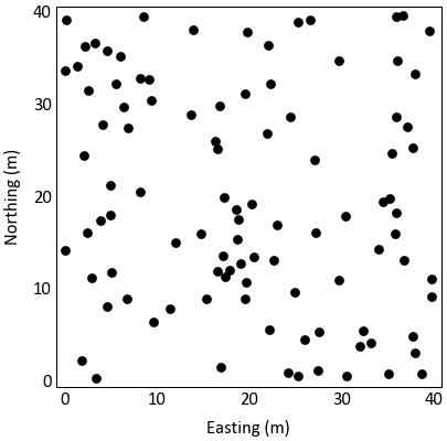
Location Map
-
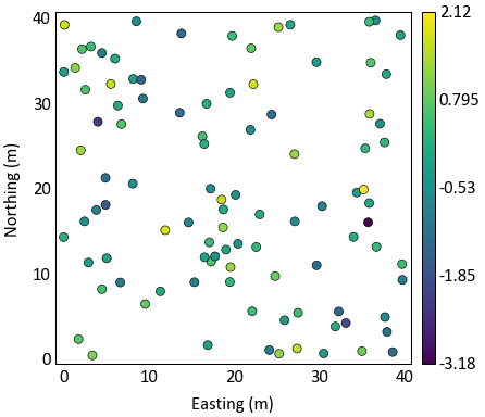
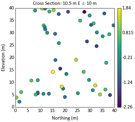
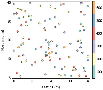
pygeostat.plotting.locmap(data, x=None, y=None, z=None, var=None, catdata=None, allcats=True, cbar=True, cbar_label=None, catdict=None, cmap=None, cax=None, vlim=None, title=None, xlabel=None, ylabel=None, unit=None, griddef=None, orient='xy', sliceno=0, slicetol=None, xlim=None, ylim=None, ax=None, figsize=None, s=None, marker='o', rotateticks=None, sigfigs=3, grid=None, axis_xy=None, aspect=None, pltstyle=None, cust_style=None, outfl=None, out_kws=None, return_cbar=False, return_plot=False, **kwargs)¶ Locmap displays scattered data on a 2-D XY plot. To plot gridded data with or without scattered data, please see
gs.pixelplt().The only required parameter is
dataif it is ags.DataFilethat contains the necessary coordinate column headers, data, and if required, a pointer to a validgs.GridDefclass. All other parameters are optional. Ifdatais ags.DataFileclass and does not contain all the required parameters or if it is a long-form table, the following parameters will need to be pass are needed:x,y,z, andgriddef. The three coordinate parameters may not be needed depending on whatorientis set to and of course if the dataset is 2-D or 3-D. The parametergriddefis required ifslicetolor `` sliceno`` is used. If parameterslicenoandslicetolis not set then the default slice tolerance is half the cell width. If a negativeslicetolis passed or sliceno is set to None then all data will be plotted.slicetolis based on coordinate units.The values used to bound the data (i.e., vmin and vmax) are automatically calculated by default. These values are determined based on the number of significant figures and the sliced data; depending on data and the precision specified, scientific notation may be used for the colorbar tick lables. When point data shares the same colormap as the gridded data, the points displayed are integrated into the above calculation.
Please review the documentation of the
gs.set_style()andgs.exportimg()functions for details on their parameters so that their use in this function can be understood.Parameters: - data (pd.DataFrame or gs.DataFile) – data containing coordinates and (optionally) var
- x (str) – Column header of x-coordinate. Required if the conditions discussed above are not met
- y (str) – Column header of y-coordinate. Required if the conditions discussed above are not met
- z (str) – Column header of z-coordinate. Required if the conditions discussed above are not met
- var (str) – Column header of the variable to use to colormap the points. Can also be a list of or single permissible matplotlib colour(s). If None and data is a DataFile, based on DataFile.variables if len(DataFile.variables) == 1. Otherwise, based on gsParams[‘plotting.locmap.c’]
- catdata (bool) – Force categorical data
- catdict (dict) – Dictionary containing the enumerated IDs alphabetic equivalent, which is drawn from gsParams[‘data.catdict’] if None
- allcats (bool) – ensures that if categorical data is being plotted and plotted on slices, that the categories will be the same color between slices if not all categories are present on each slice
- cbar (bool) – Indicate if a colorbar should be plotted or not
- cbar_label (str) – Colorbar title
- cmap (str) – A matplotlib colormap object or a registered matplotlib or pygeostat colormap name.
- cax (Matplotlib.ImageGrid.cbar_axes) – color axis, if a previously created one should be used
- vlim (float tuple) – Data minimum and maximum values
- title (str) – Title for the plot. If left to it’s default value of
Noneor is set toTrue, a logical default title will be generated for 3-D data. Set toFalseif no title is desired. - xlabel (str) – X-axis label
- ylabel (str) – Y-axis label
- unit (str) – Unit to place inside the axis label parentheses
- griddef (GridDef) – A pygeostat GridDef class created using
gs.GridDef. Required if using the argumentslicetol - orient (str) – Orientation to slice data.
'xy','xz','yz'are t he only accepted values - sliceno (int) – Grid cell location along the axis not plotted to take the slice of data to plot. None will plot all data
- slicetol (float) – Slice tolerance to plot point data (i.e. plot +/-
slicetolfrom the center of the slice). Any negative value plots all data. Requiressliceno. If aslicenois passed and noslicetolis set, then the default will half the cell width based on the griddef. - xlim (float tuple) – X-axis limits. If None, based on data.griddef.extents(). If data.griddef is None, based on the limits of the data.
- ylim (float tuple) – Y-axis limits. If None, based on data.griddef.extents(). If data.griddef is None, based on the limits of the data.
- ax (mpl.axis) – Matplotlib axis to plot the figure
- figsize (tuple) – Figure size (width, height)
- s (float) – Size of location map markers
- marker (str) – One of the permissible matplotlib markers, like ‘o’, or ‘+’… and others.
- title – Title for the plot. If left to it’s default value of
Noneor is set toTrue, a logical default title will be generated for 3-D data. Set toFalseif no title is desired. - rotateticks (bool tuple) – Indicate if the axis tick labels should be rotated (x, y)
- sigfigs (int) – Number of sigfigs to consider for the colorbar
- grid (bool) – Plots the major grid lines if True. Based on gsParams[‘plotting.grid’] if None.
- axis_xy (bool) – converts the axis to GSLIB-style axis visibility (only left and bottom visible) if axis_xy is True. Based on gsParams[‘plotting.axis_xy’] if None.
- aspect (str) – Set a permissible aspect ratio of the image to pass to matplotlib. If None, it will be ‘equal’ if each axis is within 1/5 of the length of the other. Otherwise, it will be ‘auto’.
- pltstyle (str) – Use a predefined set of matplotlib plotting parameters as specified by
gs.GridDef. UseFalseorNoneto turn it off - cust_style (dict) – Alter some of the predefined parameters in the
pltstyleselected. - outfl (str) – Output figure file name and location
- out_kws (dict) – Optional dictionary of permissible keyword arguments to pass to
gs.exportimg() - return_cbar (bool) – Indicate if the colorbar axis should be returned
- return_plot (bool) – Indicate if the plot from scatter should be returned. It can be used to create the colorbars required for subplotting with the ImageGrid()
- **kwargs – Optional permissible keyword arguments to pass to matplotlib’s scatter function
Returns: Matplotlib axis instance which contains the gridded figure
Return type: ax (ax)
Returns: Optional, default False. Matplotlib colorbar object
Return type: cbar (cbar)
Examples
A simple call:
>>> gs.locmap(data=data)
A simple call using a variable to color the data:
>>> gs.locmap(data=data, var='Var1')
Plot the data within a 10 m window the 10th cell in the
'yz'orientation. Also increase the size of the scatter plots:>>> gs.locmap(data=data, var='Var1',orient='yz', sliceno=10, slicetol=10, griddef=griddef, ... s=30)
Plot categorical data using a simple call:
>>> gs.locmap(data=data, var='Catagory')
Code author: Warren E. Black - 2016-04-08 and Ryan M. Barnett - 2018-04-13
Loadings Plot
-
pygeostat.plotting.loadingsplt(loadmat, figsize=None, ax=None, title=None, xticklabels=None, yticklabels=None, rotateticks=None, pltstyle=None, cust_style=None, outfl=None, **kwargs)¶ This function uses matplotlib to create a loadings plot with variably sized colour mapped boxes illustrating the contribution of each of the input variables to the transformed variables.
The only parameter needed
loadmatcontaining the loadings or correlation matrix. All of the other arguments are optional. Figure size will likely have to be manually adjusted. Ifxticklabelsand/oryticklabelsare left to their default value ofNoneand the input matrix is contained in a pandas dataframe, the index/column information will be used to label the columns and rows. If a numpy array is passed, axis tick labels will need to be provided. Axis tick labels are automatically checked for overlap and if needed, are rotated. If rotation is necessary, consider condensing the variable names or plotting a larger figure if the result appears odd.Please review the documentation of the
gs.set_style()andgs.exportimg()functions for details on their parameters so that their use in this function can be understood.Parameters: - loadmat – Pandas dataframe or numpy matrix containing the required loadings or correlation matrix
- figsize (tuple) – Figure size (width, height)
- ax (mpl.axis) – Matplotlib axis to plot the figure
- title (str) – Title for the plot.
- xticklabels (list) – Tick labels along the x-axis
- yticklabels (list) – Tick labels along the y-axis
- rotateticks (bool tuple) – Indicate if the axis tick labels should be rotated (x, y)
- pltstyle (str) – Use a predefined set of matplotlib plotting parameters as specified by
gs.GridDef. UseFalseorNoneto turn it off - cust_style (dict) – Alter some of the predefined parameters in the
pltstyleselected. - outfl (str) – Output figure file name and location
- **kwargs – Optional permissible keyword arguments to pass to
gs.exportimg()
Returns: matplotlib Axes object with the loadings plot
Return type: ax (ax)
Examples
Grab the correlation between the PCA variables and their corresponding input variables as a pandas dataframe:
>>> loadmat = refdata.data.corr().ix[3:6,6:9]
A simple call using the pandas dataframe:
>>> gs.loadingsplt(loadmat)
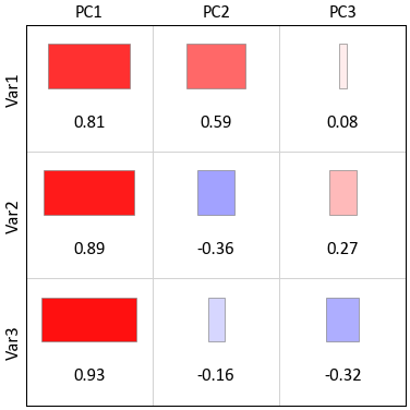
For illustration purposes, convert the dataframe to a numpy matrix and use that:
>>> gs.loadingsplt(loadmat.as_matrix())
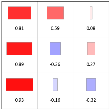
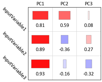
Fix the size and set the x and y axis tick labels:
>>> gs.loadingsplt(loadmat.as_matrix(), figsize=(2,2), xticklabels=['PC1', 'PC2', 'PC3'],
...                yticklabels=['InputVariable1', 'InputVariable2', 'InputVariable3'])
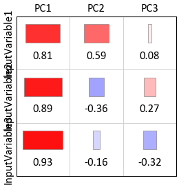
The above y-axis tick labels were automatically rotated, prevent this from happening even if it looks awful:
>>> gs.loadingsplt(loadmat.as_matrix(), figsize=(2,2), xticklabels=['PC1', 'PC2', 'PC3'],
...                yticklabels=['InputVariable1', 'InputVariable2', 'InputVariable3'],
...                rotateticks=(False, False))
Code author: Warren E. Black - 2015-10-05
Log Plot
-
pygeostat.plotting.logplot(z, var, cat=False, lw=2, lc='green', barwidth=0.5, colorlist=None, namelist=None, legend_fontsize=10, title=None, ylabel=None, unit=None, grid=None, axis_xy=None, reversey=False, aspect='auto', xlim=None, ylim=None, figsize=None, ax=None, out_kws=None, **kwargs)¶ - A well log plot for both continuous and categorical variables. This plot handles one well log plot at a time and the user can choose to generate subplots and pass the axes to this function if multiple well log plots are required.
Parameters: - z (Elevation/Depth or distance along the well) – Tidy (long-form) 1D data where a single column of the variable exists with each row is an observation. A pandas dataframe/series or numpy array can be passed.
- var (Variable being plotted) – Tidy (long-form) 1D data where a single column of the variable exists with each row is an observation. A pandas dataframe/series or numpy array can be passed.
- lw (float) – line width for log plot of a continuous variable
- lc (string) – line color for the continuous variable
- barwidth (float) – width of categorical bars
- colorlist (list) – list of colors for all the unique codes of the categorical variable
example:
colorlist=[(204, 0, 0), (255, 208, 0), (255, 147, 0), (0, 204, 0), (153, 153, 153)] - namelist (list) – list with name for all the unique codes of the categorical variable
example:
['Sand','Breccia','SIHS','MIHS','MDST'] - legend_fontsize (float) – fontsize for the legend plot rleated to the categorical codes. set this parameter to 0 if you do not want to have a legend
- title (str) – title for the variable
- ylabel (str) – Y-axis label, based on
gsParams['plotting.zname']if None. - unit (str) – Unit to place inside the y-label parentheses, based on
gsParams['plotting.unit']if None. - grid (bool) – Plots the major grid lines if True. Based on
gsParams['plotting.grid']if None. - axis_xy (bool) – converts the axis to GSLIB-style axis visibility (only left and bottom
visible) if axis_xy is True. Based on
gsParams['plotting.axis_xy']if None. - reversey (bool) – if true, the yaxis direction is set to reverse(applies to the cases that depth is plotted and not elevation)
- aspect (str) – Set a permissible aspect ratio of the image to pass to matplotlib.
- xlim (float tuple) – X-axis limits
- ylim (float tuple) – Y-axis limits
- figsize (tuple) – Figure size (width, height)
- ax (mpl.axis) – Existing matplotlib axis to plot the figure onto
- out_kws (dict) – Optional dictionary of permissible keyword arguments to pass to
gs.exportimg()
Returns: Matplotlib axis instance which contains the gridded figure
Return type: ax (ax)
Examples
A simple call:
>>> gs.logplot(df['Z'], df['phie'], cat=False, ax=ax, pltstyle=False, aspect='auto',
>>>            title='Porosity')
Code author: Mostafa Hadavand 2017-03-03 and Ryan Barnett 2018-04-13
LVA Vector Plot
-
pygeostat.plotting.lvaplt(lvafield, griddef, ax=None, orient='xy', sliceno=0, step=4, scale=35, pts=False, lw=None, plot3d=True, color='black', pltstyle=None, cust_style=None)¶ Plot the orient field on the 2D grid assuming that strike and dip are the columns in the
lvafield.Note
The plotted vectors do not consider any components other than on the given slice. e.g. a certain vector on an plan-view slice may be steeply dipping yet it appears to have equal magnitude as flat-lying vectors on this slice. This can easily be changed.
Parameters: - lvafield (ndarray) – a [griddef.count(), 2] dimensioned array with the strike-dip components following the standard GSLIB convections. Vectors are projected to 2D by ignoring the projected length. See strdip2vtk on Knowledge Base for 3D plotting
- griddef (GridDef) – a pygeostat griddef object with the relevant griddef
- ax (mpl.axis) – An axis to plot orientations on, for example, an axis is output from pixelplt
- orient (str) – the orientation of the figure
- sliceno (int) – the sliceno that is being plotted (for 3d)
- step (int) – steps through the grid if the vectors are too dense
- scale (int/float?) – larger numbers = longer vectors?
- pts (bool) – optionally plot the center locations
TODO: - Vector colors
Code author: Ryan Martin - 2017-04-26
Matrix Plot
-
pygeostat.plotting.matrixplot(matrix, ticklabels=None, xticklabels=None, yticklabels=None, rotateticks=None, title=None, annot=None, annot_clr=None, lw=0.5, vlim=None, cbar=None, cbar_label=None, cmap=None, cax=None, figsize=None, ax=None, cust_style=None, outfl=None, out_kws=None, sigfigs=None, **kwargs)¶ This function uses matplotlib to create a matrix heatmap illustrating matrices such as covariances matrices, transition probability matrices, etc.
The only parameter needed is the matrix. All of the other arguments are optional. Figure size will likely have to be manually adjusted. If the label parameters are left to their default value of
Noneand the input matrix is contained in a pandas dataframe, the index/column information will be used to label the columns and rows. If a numpy array is passed, axis tick labels will need to be provided. Axis tick labels are automatically checked for overlap and if needed, are rotated. If rotation is necessary, consider condensing the variables names or plotting a larger figure as the result is odd. Ifcbaris left to its default value ofNone, a colorbar will only be plotted if thelmatis set to True. It can also be turned on or off manually. Ifannotis left to its default value ofNone, annotations will only be placed if a full matrix is being plotted. It can also be turned on or off manually.The parameter
ticklabelsis odd in that it can take a few forms, all of which are a tuple with the first value controlling the x-axis and second value controlling the y-axis (x, y). If left to its default ofNone, another pygeostat function will check to see if the labels overlap, if so it will rotate the axis labels by a default angle of (45, -45) if required. If a value ofTrueis pased for either axis, the respective default values previously stated is used. If either value is a float, that value is used to rotate the axis labels.Please review the documentation of the
gs.set_style()andgs.exportimg()functions for details on their parameters so that their use in this function can be understood.Parameters: - matrix – Pandas dataframe or numpy matrix containing the required loadings or correlation matrix
- ticklabels (list) – Tick labels for both axes
- xticklabels (list) – Tick labels along the x-axis (overwritten if ticklabels is passed)
- yticklabels (list) – Tick labels along the y-axis (overwritten if ticklabels is passed)
- rotateticks (bool or float tuple) – Bool or float values to control axis label rotations. See above for more info.
- title (str) – Title for the plot
- annot (bool) – Indicate if the cells should be annotated or not
- annot_clr (dict) – Indicate the text color that should be used for annotation. Values greater than annotate.keys() (cutoff), are colored by the corresponding annotate.values(). E.g., annot_clr = {-1.0e21:’black’, 0.5:’white’}
- lw (float) – Line width of lines in the matrix
- vlim (tuple) – vlim for the data on the corrmat
- cbar (bool) – Indicate if a colorbar should be plotted or not
- cbar_label (str) – string for the colorbar label
- cmap (str) – valid Matplotlib colormap
- figsize (tuple) – Figure size (width, height)
- ax (mpl.axis) – Matplotlib axis to plot the figure
- cust_style (dict) – Alter some of the predefined parameters in the
pltstyleselected. - outfl (str) – Output figure file name and location
- out_kws (dict) – Optional dictionary of permissible keyword arguments to pass to
gs.exportimg() - sigfigs (int) – significant digits for labeling of colorbar and cells
- **kwargs – Optional permissible keyword arguments to pass to matplotlib’s pcolormesh function
Returns: matplotlib Axes object with the correlation matrix plot
Return type: ax (ax)
Code author: Ryan M. Barnett - 2018-04-23 (origins in Warren E. Black’s corrmat)
Pit Plot
-
pygeostat.plotting.pitplt(arr, griddef, ax=None, orient='xz', sliceno=0, lineweight=1, color='k', iso=0.5, linestyle='solid', figsize=None, xlim=None, ylim=None, title=None, xlabel=None, ylabel=None, unit=None, rotateticks=None, randomize=False, grid=None, axis_xy=None, cust_style=None, label=None, outfl=None, out_kws=None)¶ This funcion will take an array of indicators (from lg3d) and an orientation, and plot the pit shell lines for a given cross section view.
Note
This function can only deal with 1 realization in the file so if you have multiple realizations you need to either pass a slice to this function or copy 1 realization to a separate file.
Parameters: - arr (Array) – Array (DataFrame Column) passed to the program with indicator values (i.e. 0 & 1)
- ax (mpl.axis) – Matplotlib axis to plot the figure
- orient (str) – Orientation to slice data. ‘xy’, ‘xz’, ‘yz’ are the only accepted values
- sliceno (int) – Location of slice to plot
- lineweight (float) – Any Matplotlib line weight
- color (str) – Any Matplotlib color
- iso (float) – Inside or Outside of Pit limit (i.e. if greater than 0.5 inside of pit)
- linestyle (str) – Any Matplotlib linestyle
- randomize (bool) – True or False… obviously
- figsize (tuple) – Figure size (width, height)
- title (str) – Title for the plot
- xlabel (str) – X-axis label
- ylabel (str) – Y-axis label
- unit (str) – Unit to place inside the axis label parentheses
- rotateticks (bool tuple) – Indicate if the axis tick labels should be rotated (x, y)
- grid (bool) – Plots the major grid lines if True. Based on gsParams[‘plotting.grid’] if None.
- axis_xy (bool) – converts the axis to GSLIB-style axis visibility (only left and bottom visible) if axis_xy is True. Based on gsParams[‘plotting.axis_xy’] if None.
- label (str) – Legend label to be added to Matplotlib axis artist
- outfl (str) – Output figure file name and location
- out_kws (dict) – Optional dictionary of permissible keyword arguments to pass to
gs.exportimg()
Returns: Matplotlib figure instance
Return type: fig (fig)
Examples
A simple call:
>>> gs.pitplt(data.data, data.griddef, title='Pit Outline Using LG3D output')
In order to plot multiple pits (say from a file with multiple realizations) you have can plot to the same matplotlib axis. For multiple realizations using a loop is the easiest as shown below.
>>> sim = gs.DataFile(flname='SGS.lg3d', griddef=grid_5m)
Loop through the SGSIM LG3D output file
First plot the first realization and grab the matplotlib axis
>>> import matplotlib.pyplt as plt
... rmin = 0
... rmax = pit.griddef.count()
... fig = gs.pitplt(sim.data[rmin:rmax], sim.griddef, title='Pit Outline Using LG3D output
...                 with Multiple Realizations')
... ax = fig.gca()
Then loop through the rest of the realizations (Say 50) and plot them on current axis
>>> for i in range (1, 50):
...     rmin = i*pit.griddef.count()
...     rmax = rmin + pit.griddef.count()
...     gs.pitplt(sim.data[rmin:rmax], sim.griddef, ax=ax)
Save the figure
>>> gs.exportimg('pitplot_mr.png', format='png')
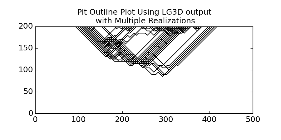
Matthew Deutsch - 2014 Updated by Jared Deutsch - 2014 Updated by Tyler Acorn - 2015 Updated by Ryan Barnett - 2018
Pixel Plot
-
pygeostat.plotting.pixelplt(data, griddef=None, var=None, catdata=None, pointdata=None, pointvar=None, pointtol=None, pointkws=None, pointcmap=None, orient='xy', sliceno=0, ax=None, figsize=None, vlim=None, clim=None, title=None, xlabel=None, ylabel=None, unit=None, rotateticks=None, cbar=True, cbar_label=None, catdict=None, cbar_label_pad=None, cax=None, sigfigs=3, cmap=None, interp='none', aspect=None, grid=None, axis_xy=None, rasterize=False, pltstyle=None, cust_style=None, outfl=None, out_kws=None, return_cbar=False, return_plot=False, slicethickness=None, cbar_nticks=5, plotformat_dict=None, **kwargs)¶ Pixelplt displays a 2D gridded dataset or a slice of a 3D gridded dataset. To plot only scattered data, please see
gs.locmap()The only required parameters are
dataandgriddef. All other parameters are optional or calculated automatically. Axis tick labels are automatically checked for overlap and if needed, are rotated. The figure instance is always returned. To allow for easier modification, the colorbar object and the data used to generate the plot can also be returned. Examples of their use are provided bellow.The values use to bound the data (i.e., vmin and vmax) are automatically calculated by default. These values are determined based on the number of significant figures and the sliced data; depending on data and the precision specified, scientific notation may be used for the colorbar tick lables. When point data shares the same colormap as the gridded data, the points displayed are integrated into the above calculation.
Categorical data can be used, however
catdatawill need to be set toTruefor proper implementation. Categorical colour palettes are available within pygeostat. See the documentation forgs.get_palette()for more information.Please review the documentation of the
gs.set_style()andgs.exportimg()functions for details on their parameters so that their use in this function can be understood.Parameters: - data – A numpy ndarray, pandas DataFrame or pygeostat DataFile, where each column is a variable and each row is an observation
- griddef (GridDef) – A pygeostat GridDef class, which must be provided if a
DataFile is not passed as data with a valid internal GridDef
gs.GridDef - var (str,int) – The name of the column within data to plot. If an int is provided, then it corresponds with the column number in data. If None, the first column of data is used.
- catdata (bool) – Indicate if the data is categorical or not. Will be automatically set if
less than gsParams[‘plotting.assumecat’] unique values are found within
data - pointdata (DataFile) – A pygeostat DataFile class created using
gs.DataFilecontaing point data to overlay the gridded data with. Must have the necessary coordinate column headers stored within the class. - pointvar (str) – Column header of variable to plot within
pointdataor a permissible matplotlib colour - pointtol (float) – Slice tolerance to plot point data (i.e. plot +/-
pointtolfrom the center of the slice). Any negative value plots all data. Default is to plot all data. - pointkws (dict) – Optional dictionary of permissible keyword arguments to pass to
matplotlib’s scatter function. Default values is
{'marker':'o', 's':15} - orient (str) – Orientation to slice data.
'xy','xz','yz'are the only accepted values - sliceno (int) – Grid cell location along the axis not plotted to take the slice of data to plot
- ax (mpl.axis) – Matplotlib axis to plot the figure
- figsize (tuple) – Figure size (width, height)
- vlim (float tuple) – Data minimum and maximum values
- clim (int tuple) or (list) – Categorical data minimum and maximum values, Forces categorical colorbar to plot the full range of categorical values - even if none show in the plot. Can be either a tuple of integer values OR a list of integers.
- title (str) – Title for the plot. If left to it’s default value of
Noneor is set toTrue, a logical default title will be generated for 3-D data. Set toFalseif no title is desired. - xlabel (str) – X-axis label
- ylabel (str) – Y-axis label
- unit (str) – Unit to place inside the axis label parentheses
- rotateticks (bool tuple) – Indicate if the axis tick labels should be rotated (x, y)
- cbar (bool) – Indicate if a colorbar should be plotted or not
- cbar_label (str) – Colorbar title
- catdict (dict) – Dictionary to map enumerated catagories to names (e.g., {100: ‘Unit1’}). Taken from gsParams[‘data.catdict’] if catdata=True and its keys align.
- sigfigs (int) – Number of sigfigs to consider for the colorbar
- cmap (str) – Matplotlib or pygeostat colormap or palette
- interp (str) – plt.imshow interpolation option;
'spline36'(continuous) and'hermite'(categorical) are good starting points if smoothing is desired.'none'is the default setting - aspect (str) – Set a permissible aspect ratio of the image to pass to matplotlib. If None, it will be ‘equal’ if each axis is within 1/5 of the length of the other. Otherwise, it will be ‘auto’.
- grid (bool) – Plots the major grid lines if True. Based on gsParams[‘plotting.grid’] if None.
- axis_xy (bool) – converts the axis to GSLIB-style axis visibility (only left and bottom visible) if axis_xy is True. Based on gsParams[‘plotting.axis_xy’] if None.
- rasterize (bool) – Indicate if the gridded image should be rasterized during export. The output resolution is depended on the DPI setting used during export.
- pltstyle (str) – Use a predefined set of matplotlib plotting parameters as specified by
gs.GridDef. UseFalseorNoneto turn it off - cust_style (dict) – Alter some of the predefined parameters in the
pltstyleselected. - outfl (str) – Output figure file name and location
- out_kws (dict) – Optional dictionary of permissible keyword arguments to pass to
gs.exportimg() - return_cbar (bool) – Indicate if the colorbar axis should be returned
- return_plot (bool) – Indicate if the plot from imshow should be returned. It can be used to create the colorbars required for subplotting with the ImageGrid()
- **kwargs – Optional permissible keyword arguments to pass to matplotlib’s imshow function
Returns: ax (ax): Matplotlib axis instance which contains the gridded figure return_cbar: ax (ax), cbar (cbar): Optional, default False. Matplotlib colorbar object retrun_plot: ax (ax), plot(?): Optional, default False. Matplotlib colorbar object return_cbar & return_plot ax, plot, cbar: default False
Return type: Default
Examples
A simple call:
>>> gs.pixelplt(data.data, griddef=griddef)
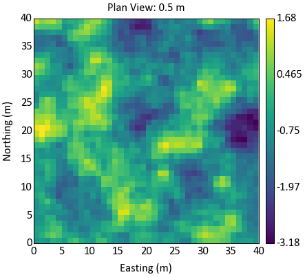
Take a difference slice and flip the y-axis tick labels, change the colormap, interpolate, and turn the default title off:
>>> gs.pixelplt(data.data, griddef=griddef, orient='yz', sliceno=20, cmap='inferno',
...             interp='spline36', rotateticks=(False, True), title=False)
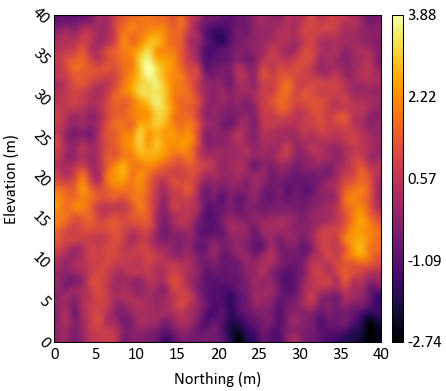
Add a custom title, set the value limits manually, change the units of the axis labels:
>>> gs.pixelplt(data.data, griddef=griddef, orient='yz', sliceno=20, interp='spline36',
...             title='Variable YZ (Slice 20)', vlim=(-4, 4), unit='ft')
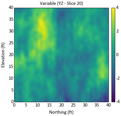
Change the axis labels, manually rotate the y-axis tick labels:
>>> gs.pixelplt(data.data, griddef=griddef, orient='yz', sliceno=20, interp='spline36',
...             xlabel='Grid North (m)', ylabel='Elevation (m)', rotateticks=(False,True))
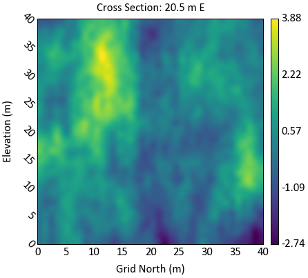
If you prefer to force additional significant figures by adding trailing zeros, you can do this two different ways: (1) modify the colorbar object directly or (2) set vlim manually and increase sigfigs to the necessary value:
>>> gs.pixelplt(largedata.data, griddef=griddef, orient='xy', sliceno=1, vlim=(0, 155000),
...             sigfigs=6)
Modify the y-axis tick labels manually, return the colorbar object and modify it:
>>> fig, cbar = gs.pixelplt(data.data, griddef=griddef, return_cbar=True,
...                         interp='spline36')
>>> #Get the axis the plot is located on
>>> ax = fig.get_axes()
>>> #Rotate the y-axis tick labels
>>> ylabels = [label.get_text() for label in ax.get_yticklabels()]
>>> ax.set_yticklabels(ylabels, rotation=-30)
>>> #Change the x-axis tick labels and location
>>> xlabels = [0, 20, 40]
>>> ax.xaxis.set_ticks(xlabels)
>>> ax.xaxis.set_ticklabels(xlabels, ha='center')
>>> #Set a label for the colorbar
>>> cbar.set_label('Variable (unit)', rotation=270)
>>> #Grab the current labels so they can be easily reused
>>> ylabels = [label.get_text() for label in cbar.ax.get_yticklabels()]
>>> #Modify the tick locations
>>> cbar.set_ticks([float(ylabels[0]), 0, float(ylabels[4])])
>>> #Set new tick labels
>>> cbar.set_ticklabels([r'$\geq$'+ylabels[0], '0.00', ylabels[4]], update_ticks=True)
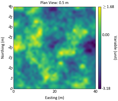
Plot the pixelplt without a colorbar then manually build the colorbar. Using the function
gs.slicegrid()the 3-D data can be sliced and use for the colorbar.Plot the colorbar on the bottom axis by returning the data used for the slice and plotting the colorbar manually:
>>> # Plot the pixelplt
>>> fig = gs.pixelplt(data.data, griddef=griddef, xlabel=False, cbar=False,
...                   interp='spline36', title=False)
>>> #Get the axis the plot is located on
>>> ax = fig.get_axes()
>>> #Move the x-axis ticks and label to the top
>>> ax.xaxis.tick_top()
>>> ax.xaxis.set_label_position('top')
>>> ax.set_xlabel('Easting (m)')
>>> #Set-up axis to plot colorbar in
>>> divider = make_axes_locatable(ax)
>>> cax = divider.append_axes('bottom', size=0.075, pad=0.07)
>>> # Get the slice of the data used by pixelplt
>>> temp_data = gs.slicegrid(data.data.values, griddef=griddef, orient='xy', sliceno=1)
>>> #Use the utility within pygeostat to get the colorbar tick location and labels,
>>> #can set manually.
>>> _, ticklocs, ticklabels = gs.get_contcbarargs(temp_data)
>>> #Plot the colorbar and label it
>>> cbar = plt.colorbar(fig, cax=cax, ticks=ticklocs, orientation='horizontal')
>>> cbar.ax.set_xticklabels(ticklabels, ha='center')
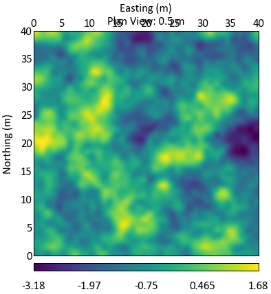
A simple call using categorical data:
>>> gs.pixelplt(data.data, catdata=True, griddef=griddef)
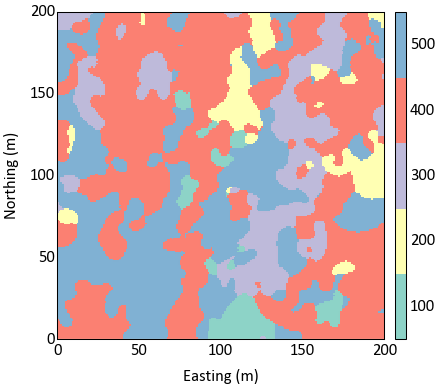
Add interpolation and change the colour palette used:
>>> gs.pixelplt(data.data, catdata=True, griddef=griddef, interp='hermite',
...             cmap='cat_vibrant')
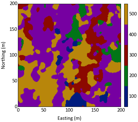
Adding all point data to the pixelplt with a simple call:
>>> gs.pixelplt(data.data, griddef=griddef, pointdata=pointdata)
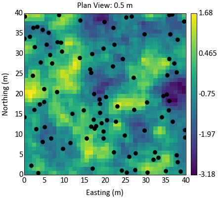
Have the point data use the same colour map as the gridded data, change the marker size, and decrease the point data slice tolerance:
>>> gs.pixelplt(data.data, griddef=griddef, pointdata=pointdata, pointvar='Var1',
...             pointtol=5, pointkws={'marker':'o', 's':5})

Code author: Matthew Deutsch, Warren E. Black - 2016-04-11
Pixel Plot 3D Grid Slicer
-
pygeostat.plotting.gridslicer(data, griddef, supxlabel=True, supylabel=True, suptitle=None, ncol=None, nrow=None, startsl=None, endsl=None, figsize=None, nslice=None, sltitle=True, unit=None, pltstyle=None, cust_style=None, outfl=None, out_kws=None, cbar_label=None, axpad=0.15, cbar_cats=None, ntickbins=None, axfuncs=None, label_mode='L', **kwargs)¶ Gridslicer can be used to automatically generate
beautifulplotem style set of slices through a 3D gridded realization. Given some target number of rows, columns, orientation and slice ranges through the realization, this function will automatically generate the pixelplt slices and arrange them according to the specified dimensions. It is possible to pass keyword arguments for pixelplt to this function in order to specify the format of the pixelplts. So, Adding data locations, different colormaps, and other pixelplt formatting is permitted for all subplots by passing those pixelplt arguments to this function. Seegs.pixelplt()for the full list of permissable kwargs.Updates April 2016 - use a ImageGrid subplots to get the job done
Parameters: - data (array, dataframe) – array of data, passed directly to pixelplt()
- griddef (pygeostat griddef) – pygeostat grid definitions, passed directly to pixelplt()
- supxlabel (str) – super x axis label
- supylabel (str) – super y axis label
- suptitle (str) – super title for the subplots
- ncol (int) – the number of columns considered for the subplots (may change)
- nrow (int) – the number of rows considered for the subplots (may change)
- startsl (int) – the starting slice to be plotted
- endsl (int) – the end slice to be plotted
- figsize (tuple) – size of the figure to be created
- nslice (int) – the number of desired slices
- sltitle (bool) – either plot the orientation and slice no on top of each slice, or dont!
- unit (str) – Unit to place inside the axis label parentheses
- pltstyle (str) – Use a predefined set of matplotlib plotting parameters as specified by
gs.GridDef. UseFalseorNoneto turn it off - cust_style (dict) – Alter some of the predefined parameters in the
pltstyleselected. - outfl (str) – Output figure file name and location
- out_kws (dict) – Optional dictionary of permissible keyword arguments to pass to
gs.exportimg() - cbar_label (str) – colorbar title
- axpad (float) – figure points padding applied to the axes, vertical padding is further modified to account for the slice titles, if required
- ntickbins (int or tuple) – The number of tick bins for both axes, or the (x, y) respectively
- axfuncs (function or list of functions) – External function(s) that takes ax sliceno and orient as keyword arguments, does not return anything
- label_mode (str) – default ‘L’, or ‘all’, passed to the ImageGrid() constructor
- **kwargs – NOTE the arguments here are either valid pixelplt (including all keyword) dictionary arguments, or valid imshow and valid imshow keyword arguments. If errors are thrown from invalid arguments it is likely that something that shouldnt have been passed to imshow was passed. Check and double check those **kwargs!
Returns: figure handle
Return type: fig (plt.figure)
Examples
The simplest call, generates a set of slices through the realization:
>>> fig = gs.gridslicer(data.data, griddef)
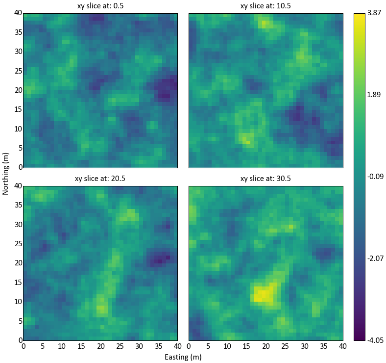
Possible to specify the orientation and the number of slices:
>>> fig = gs.gridslicer(data.data, griddef, orient='xz', nslice=5)
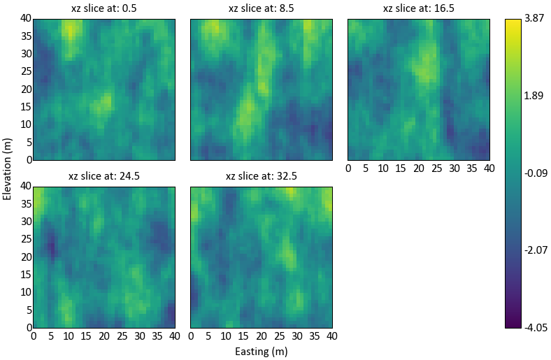
Can specify the number of rows or columns required for the slices:
>>> fig = gs.gridslicer(data.data, griddef, orient='yz', nslice=6, ncol=2, nrow=3)
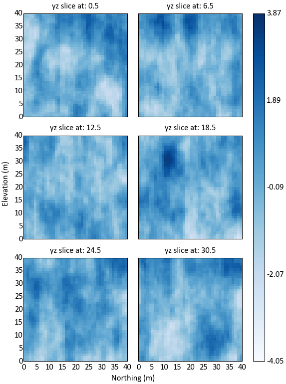
Also able to specify pixelplt kwargs using this function, so we can apply consistent custom formatting to all of the subplots:
>>> gs.gridslicer(data.data, griddef, nrow=2, ncol=5, startsl=13, endsl=35, nslice=10,
...               cmap='jet', vlim=(-3,3))
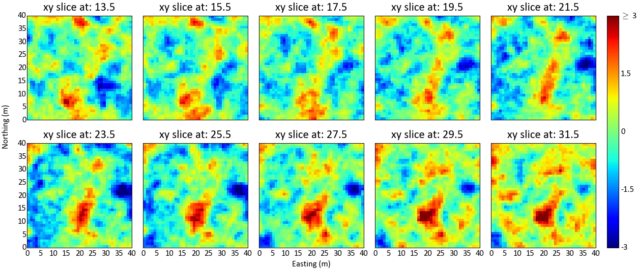
Finally, the figure handles are returned for all calls to this function, so to save the figure use plt.savefig(flname):
>>> gs.exportimg('filename.png', transparent=True)
Or, specify the outfl name to automatically generate the required figure
Code author: Ryan Martin - 2015-10-16
Probability Plot
-
pygeostat.plotting.probplt(data, wt=None, lower=None, upper=None, logscale=True, ax=None, figsize=None, xlim=None, ylim=(0.01, 99.99), nyticks=15, title=None, xlabel=None, s=2, color='k', grid=True, axis_xy=None, line=False, pltstyle=None, cust_style=None, outfl=None, out_kws=None, **kwargs)¶ Create either a normal or a lognormal probability plot. This plot displays all the data values on a chart that illustrates the general distribution shape and the behaviour of the extreme values. Please review the documentation of the
gs.set_style()andgs.exportimg()functions for details on their parameters so that their use in this function can be understood.This function requires the python package probscale. It can be installed be executing the following code in the command prompt:
>>> pip install probscale
Parameters: - data – Tidy (long-form) 1D data where a single column of the variable exists with each row is an observation. A pandas dataframe/series or numpy array can be passed.
- wt – 1D dataframe, series, or numpy array of declustering weights for the data.
- lower (float) – Lower trimming limits
- upper (float) – Upper trimming limits
- ax (mpl.axis) – Matplotlib axis to plot the figure
- figsize (tuple) – Figure size (width, height)
- xlim (float tuple) – Minimum and maximum limits of data along the x axis
- ylim (float tuple) – Minimum and maximum limits of data along the y axis, e.g.(0.001, 99.999)
- nyticks (int) – the number of ticks on the y axis to show. Currently disabled due to altered matplotlib functionality.
- title (str) – Title for the plot
- xlabel (str) – X-axis label. A default value of
Nonewill try and grab a label from the passeddata. PassFalseto not have an xlabel. - s (int) – Size of points
- color (str or int) – Any permissible matplotlib color or a integer which is used to draw a
color from the pygeostat color pallet
pallet_pastel(useful for iteration) - grid (bool) – plots the major grid lines if True. Based on gsParams[‘plotting.grid’] if None.
- axis_xy (bool) – converts the axis to GSLIB-style axis visibility (only left and bottom visible) if axis_xy is True. Based on gsParams[‘plotting.axis_xy’] if None.
- pltstyle (str) – Use a predefined set of matplotlib plotting parameters as specified by
gs.GridDef. UseFalseorNoneto turn it off - cust_style (dict) – Alter some of the predefined parameters in the
pltstyleselected. - outfl (str) – Output figure file name and location
- out_kws (dict) – Optional dictionary of permissible keyword arguments to pass to
gs.exportimg() - **kwargs – Optional permissible keyword arguments to pass to matplotlib’s scatter function
Returns: matplotlib Axes object with the histogram
Return type: ax (ax)
Examples
A simpel call:
>>> gs.probplt(data.data['Bitumen'], xlim=(1, 100))
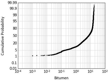
Code author: Warren E. Black - 2016-08-17
Quantity Metal Plot
-
pygeostat.plotting.qmplt(dataframe, variable, graderange, steps, lencol=None, complen=None, title=None, ax=None, qmclr='red', pctclr='blue', pltstyle=None, cust_style=None)¶ Calculate and plot the % quantity of metal above cutoff and % of database above cutoff for the given grade range from a the table containing drill hole information
Parameters: - dataframe (DataFile or pd.DataFrame) – the datafile or dataframe with the variable of interest
- variable (str) – the variable of interest in the dataframe
- graderange (tuple) – the (min, max) values to calculate
- steps (int) – the number of steps between min and max
- title (str) – the title of the plot
- lencol (str) – the column in the datafile containing the length of each sample
- complen (float) – if no length information is available, give a constant composite length for all data in this datafile
- ax (mpl axes) – optional axis to plot on
Returns: the plotting axis
Return type: ax (mpl axes)
Code author: Ryan Martin - 2017-09-25
Quantile-Quantile Plot
-
pygeostat.plotting.qqplt(data, refdata, datwt=None, refwt=None, limits=None, npoints=0, logscale=None, ax=None, figsize=None, title=None, xlabel=None, ylabel=None, s=None, percent=True, color='k', grid=None, axis_xy=None, pltstyle=None, cust_style=None, outfl=None, out_kws=None, line=True, ntickbins=5, **kwargs)¶ Plot a QQ plot between the reference. Pretty much the probplt but with 2 datasets and plotting the quantiles between them
Parameters: - data – Tidy (long-form) 1D data where a single column of the variable exists with each row is an observation. A pandas dataframe/series or numpy array can be passed.
- refdata – Tidy (long-form) 1D data or a valid scipy.stats distribution (e.g. “norm”). A pandas dataframe/series or numpy array can be passed.
- datwt – 1D dataframe, series, or numpy array of declustering weights for the data.
- refwt – 1D dataframe, series, or numpy array of declustering weights for the data.
- lower (float) – Lower trimming limits
- upper (float) – Upper trimming limits
- limits (tuple) – the min and max value of the axes
- ax (mpl.axis) – Matplotlib axis to plot the figure
- logscale (bool) – yes or no to logscale
- npoints (int) – set to 0 to use all points
- figsize (tuple) – Figure size (width, height)
- xlim (float tuple) – Minimum and maximum limits of data along the x axis
- title (str) – Title for the plot
- xlabel (str) – X-axis label. A default value of
Nonewill try and grab a label from the passeddata. PassFalseto not have an xlabel. - s (int) – Size of points
- color (str or int) – Any permissible matplotlib color or a integer which is used to draw a
color from the pygeostat color pallet
pallet_pastel(useful for iteration) - grid (bool) – plots the major grid lines if True. Based on gsParams[‘plotting.grid’] if None.
- axis_xy (bool) – converts the axis to GSLIB-style axis visibility (only left and bottom visible) if axis_xy is True. Based on gsParams[‘plotting.axis_xy’] if None.
- pltstyle (str) – Use a predefined set of matplotlib plotting parameters as specified by
gs.GridDef. UseFalseorNoneto turn it off - cust_style (dict) – Alter some of the predefined parameters in the
pltstyleselected. - outfl (str) – Output figure file name and location
- out_kws (dict) – Optional dictionary of permissible keyword arguments to pass to
gs.exportimg() - line (bool) – Plot the reference 1:1 line
- ntickbins (int or tuple) – modify the number of ticks. Only works if logscale ==
True - **kwargs – Optional permissible keyword arguments to pass to matplotlib’s scatter function
Returns: matplotlib Axes object with the histogram
Return type: ax (ax)
Examples
A simple call:
>>> gs.qqplt(data.data['Bitumen'], np.random.randn(1000))
Code author: Warren E. Black (probplt) - modified by Ryan Martin for qqplt - 2017-04-06
Scatter Plot
-
pygeostat.plotting.scatplt(x, y, wt=None, nmax=None, s=None, c=None, alpha=None, cmap=None, clim=None, cbar=False, cbar_label=None, stat_blk=None, stat_xy=None, stat_ha=None, stat_fontsize=None, roundstats=None, sigfigs=None, xlim=None, ylim=None, xlabel=None, ylabel=None, title=None, grid=None, axis_xy=None, label='_nolegend_', ax=None, figsize=None, return_plot=False, **kwargs)¶ Scatter plot that mimics the GSLIB scatplt program, providing summary statistics, kernel density estimate coloring, etc. NaN values are treated as null and removed from the plot and statistics.
Parameters: - x (np.ndarray or pd.Series) – 1-D array with the variable to plot on the x-axis.
- y (np.ndarray or pd.Series) – 1-D array with the variable to plot on the y-axis.
Keyword Arguments: - wt (np.ndarray or pd.DataFrame) – 1-D array with weights that are used in the calculation of displayed statistics.
- s (float or np.ndarray or pd.Series) – size of each scatter point. Based on gsParams[‘plotting.scatplt.s’] if None.
- c (color or np.ndarray or pd.Series) – color of each scatter point, as an array or valid Matplotlib color. Alternatively, ‘KDE’ may be specified to color each point according to its associated kernel density estimate. Based on gsParams[‘plotting.scatplt.c’] if None.
- nmax (int) – specify the maximum number of scatter points that should be displayed, which may be necessary due to the time-requirements of plotting many data. If specified, a nmax-length random sub-sample of the data is plotted. Note that this does not impact summary statistics.
- alpha (float) – opacity of the scatter. Based on gsParams[‘plotting.scatplt.alpha’] if None.
- cmap (str) – A matplotlib colormap object or a registered matplotlib
- clim (float tuple) – Data minimum and maximum values
- cbar (bool) – Indicate if a colorbar should be plotted or not
- cbar_label (str) – Colorbar title
- stat_blk (str or list) – statistics to place in the plot, which should be ‘all’ or a list that may contain [‘count’, ‘pearson’, ‘spearman’, ‘noweightflag’]. Based on gsParams[‘plotting.scatplt.stat_blk’] if None. Set to False to disable.
- stat_xy (float tuple) – X, Y coordinates of the annotated statistics in figure space. Based on gsParams[‘plotting.scatplt.stat_xy’] if None.
- stat_ha (str) – Horizontal alignment parameter for the annotated statistics. Can be
'right','left', or'center'. If None, based on gsParams[‘plotting.stat_ha’] - stat_fontsize (float) – the fontsize for the statistics block. If None, based on gsParams[‘plotting.stat_fontsize’]. If less than 1, it is the fraction of the matplotlib.rcParams[‘font.size’]. If greater than 1, it the absolute font size.
- roundstats (bool) – Indicate if the statistics should be rounded to the number of digits or
to a number of significant figures (e.g., 0.000 vs. 1.14e-5). The number of digits or
figures used is set by the parameter
sigfigs. sigfigs (int): Number of significant figures or number of digits (depending onroundstats) to display for the float statistics. Based on gsParams[‘plotting.roundstats’] and gsParams[‘plotting.roundstats’] and gsParams[‘plotting.sigfigs’] if None. - xlim (tuple) – x-axis limits - xlim[0] to xlim[1]. Based on the data if None
- ylim (tuple) – y-axis limits - ylim[0] to ylim[1]. Based on the data if None.
- xlabel (str) – label of the x-axis, extracted from x if None
- ylabel (str) – label of the y-axis, extracted from y if None
- title (str) – plot title
- grid (bool) – plot grid lines in each panel? Based on gsParams[‘plotting.grid’] if None.
- axis_xy (bool) – if True, mimic a GSLIB-style scatplt, where only the bottom and left axes lines are displayed. Based on gsParams[‘plotting.axis_xy’] if None.
- label (str) – label of scatter for legend
- ax (Matplotlib axis handle) – if None, create a new figure and axis handles
- figsize (tuple) – size of the figure, if creating a new one when ax = None
- **kwargs – Optional permissible keyword arguments to pass to either: (1) matplotlib’s scatter function
Returns: ax(Matplotlib axis handle)
Examples:
Basic scatter example:
import pygeostat as gs

# Load the data, which registers the variables attribute
data = gs.ExampleData('point3d_ind_mv')

# Select a couple of variables
x, y = data[data.variables[0]], data[data.variables[1]]

# Scatter plot with default parameters
gs.scatplt(x, y, figsize=(5, 5))

# Scatter plot without correlation and with a color bar:
gs.scatplt(x, y, nmax=2000, stat_blk=False, cbar=True, figsize=(5, 5))

# Scatter plot with the a constant color, transparency and all statistics
# Also locate the statistics where they are better seen
gs.scatplt(x, y, c='k', alpha=0.2, nmax=2000, stat_blk='all', stat_xy=(.95, .95),
           figsize=(5, 5))
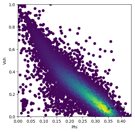
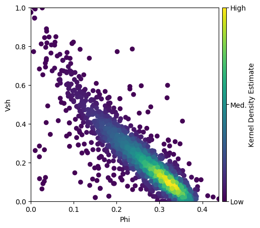
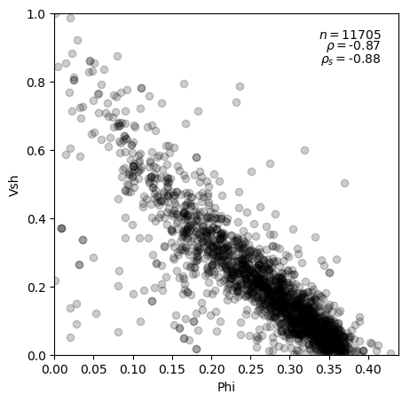
Code author: Ryan Barnett - 2018-03-26
Scatter Plots
-
pygeostat.plotting.scatplts(data, variables=None, wt=None, labels=None, nmax=None, pad=0.0, s=None, c=None, alpha=None, cmap=None, clim=None, cbar=True, cbar_label=None, stat_blk=None, stat_xy=None, stat_ha=None, stat_fontsize=None, roundstats=None, sigfigs=None, grid=None, axis_xy=None, xlim=None, ylim=None, label='_nolegend_', figsize=None, **kwargs)¶ Function which wraps the scatplt function, creating an upper matrix triangle of scatterplots for multiple variables.
Parameters: data (np.ndarray or pd.DataFrame or gs.DataFile) – 2-D data array, which should be dimensioned as (ndata, nvar). Alternatively, specific variables may be selected with the variables argument. If a DataFile is passed and data.variables has a length greater than 1, those columns will be treated as the variables to plot.
Keyword Arguments: - variables (str list) – indicates the column names to treat as variables in data
- wt (np.ndarray or pd.Series or str or bool) – array with weights that are used in the calculation of displayed statistics. Alternatively, a str may specify the weight column in lower. If data is a DataFile and data.wts is not None, then wt=True may be used to apply those weights.
- labels (tuple or nvar-list) – labels for data, which are drawn from data if None
- nmax (int) – specify the maximum number of scatter points that should be displayed, which may be necessary due to the time-requirements of plotting many data. If specified, a nmax-length random sub-sample of the data is plotted. Note that this does not impact summary statistics.
- pad (float or 2-tuple) – space between each panel, which may be negative or positive. A tuple of (xpad, ypad) may also be used.
- align_orient (bool) – align the orientation of plots in the upper and lower triangle (True), which causes the lower triangle plots to be flipped (x and y axes) from their standard symmetric orientation.
- titles (2-tuple str) – titles of the lower and upper triangles (lower title, upper title)
- titlepads (2-tuple float) – padding of the titles to the left of the lower triangle titlepads[0] and above the upper triangle (titlepads[1]). Typical required numbers are in the range of 0.01 to 0.5, depending on figure dimensioning.
- titlesize (int) – size of the title font
- s (float or np.ndarray or pd.Series) – size of each scatter point. Based on gsParams[‘plotting.scatplt.s’] if None.
- c (color or np.ndarray or pd.Series) – color of each scatter point, as an array or valid Matplotlib color. Alternatively, ‘KDE’ may be specified to color each point according to its associated kernel density estimate. Based on gsParams[‘plotting.scatplt.c’] if None.
- alpha (float) – opacity of the scatter. Based on gsParams[‘plotting.scatplt.alpha’] if None.
- cmap (str) – A matplotlib colormap object or a registered matplotlib
- clim (2-tuple float) – Data minimum and maximum values
- cbar (bool) – plot a colorbar for the color of the scatter (if variable)? (default=True)
- cbar_label (str) – colorbar label(automated if KDE coloring)
- stat_blk (str or tuple) – statistics to place in the plot, which should be ‘all’ or a tuple that may contain [‘count’, ‘pearson’, ‘spearman’]. Based on gsParams[‘plotting.scatplt.stat_blk’] if None. Set to False to disable.
- stat_xy (2-tuple float) – X, Y coordinates of the annotated statistics in figure space. Based on gsParams[‘plotting.scatplt.stat_xy’] if None.
- stat_ha (str) – Horizontal alignment parameter for the annotated statistics. Can be
'right','left', or'center'. If None, based on gsParams[‘plotting.stat_ha’] - stat_fontsize (float) – the fontsize for the statistics block. If None, based on gsParams[‘plotting.stat_fontsize’]. If less than 1, it is the fraction of the matplotlib.rcParams[‘font.size’]. If greater than 1, it the absolute font size.
- roundstats (bool) – Indicate if the statistics should be rounded to the number of digits or
to a number of significant figures (e.g., 0.000 vs. 1.14e-5). The number of digits or
figures used is set by the parameter
sigfigs. sigfigs (int): Number of significant figures or number of digits (depending onroundstats) to display for the float statistics. Based on gsParams[‘plotting.roundstats’] and gsParams[‘plotting.roundstats’] and gsParams[‘plotting.sigfigs’] if None. - grid (bool) – plot grid lines in each panel? Based on gsParams[‘plotting.grid’] if None.
- axis_xy (bool) – if True, mimic a GSLIB-style scatplt, where only the bottom and left axes lines are displayed. Based on gsParams[‘plotting.axis_xy’] if None.
- xlim (2-tuple float) – x-axis limits - xlim[0] to xlim[1]. Based on the data if None
- ylim (2-tuple float) – y-axis limits - ylim[0] to ylim[1]. Based on the data if None.
- label (str) – label of scatter for legend
- figsize (2-tuple float) – size of the figure, if creating a new one when ax = None
- return_handles (bool) – return figure handles? (default=False)
- **kwargs – Optional permissible keyword arguments to pass to either: (1) matplotlib’s scatter function
Returns: matplotlib figure handle
Example:
Only one basic example is provided here, although all kwargs applying to the underlying scatplt function may be applied to scatplts.
import pygeostat as gs

# Load the data, which registers the variables attribute
data = gs.ExampleData('point3d_ind_mv')

# Plot with the default KDE coloring
fig = gs.scatplts(data, nmax=1000, stat_xy=(0.95, 0.95), pad=(-5.5, -3), s=10,
                  figsize=(10, 10))
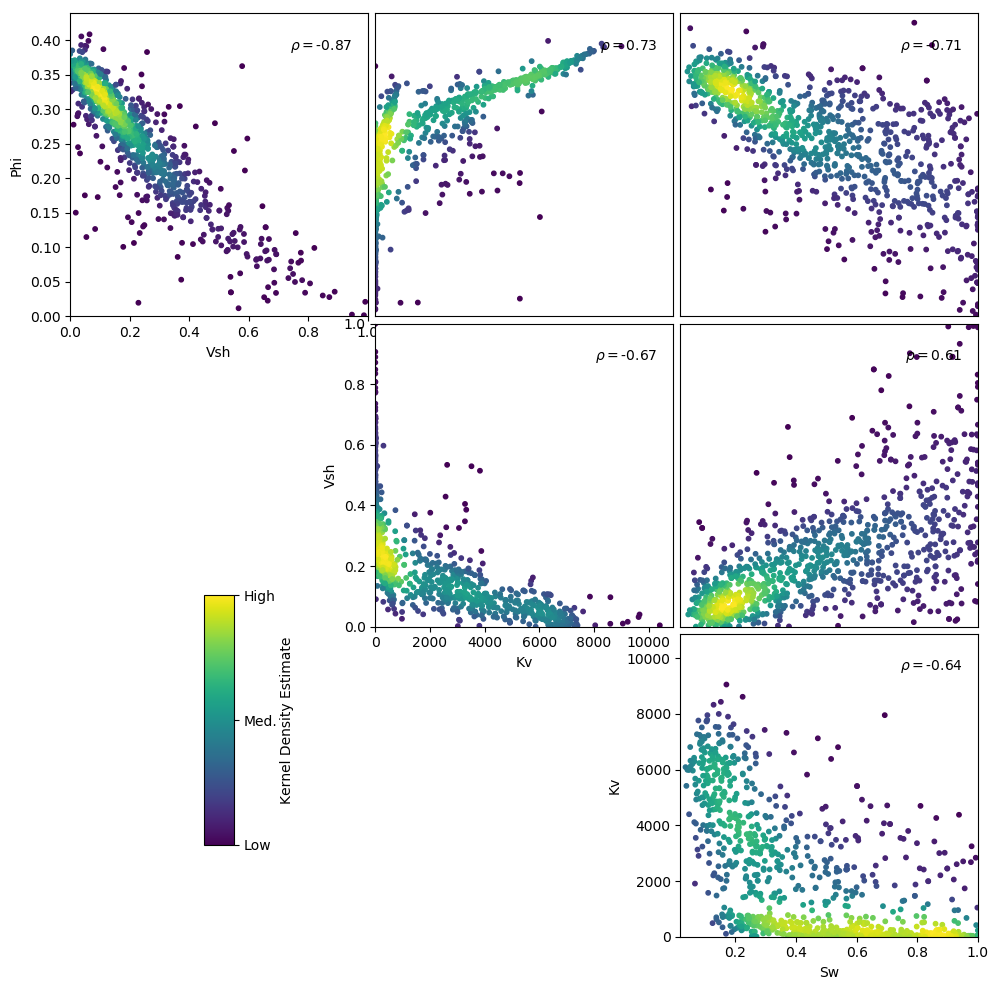
Code author: Ryan Barnett - 2018-03-26
Scatter Plot Lower Upper
-
pygeostat.plotting.scatplts_lu(lower, upper, lowvariables=None, uppvariables=None, lowwt=None, uppwt=None, lowlabels=None, upplabels=None, nmax=None, pad=0.0, align_orient=False, titles=None, titlepads=None, titlesize=None, s=None, c=None, alpha=None, cbar=True, cbar_label=None, cmap=None, clim=None, stat_blk=None, stat_xy=None, stat_ha=None, stat_fontsize=None, roundstats=None, sigfigs=None, xlim=None, ylim=None, label='_nolegend_', grid=True, axis_xy=None, figsize=None, return_handle=False, **kwargs)¶ Function which wraps the scatplt function, creating an upper/lower matrix triangle of scatterplots for comparing the scatter of multiple variables in two data sets.
Parameters: - lower (np.ndarray or pd.DataFrame or gs.DataFile) – 2-D data array, which should be dimensioned as (ndata, nvar). Alternatively, specific variables may be selected with the variables argument. If a DataFile is passed and data.variables has a length greater than 1, those columns will be treated as the variables to plot. This data is plotted in the lower triangle.
- upper (np.ndarray or pd.DataFrame or gs.DataFile) – see the description for lower, although this data is plotted in the upper triangle.
Keyword Arguments: - lowvariables (nvar-tuple str) – indicates the column names to treat as variables in lower
- uppvariables (nvar-tuple str) – indicates the column names to treat as variables in upper
- lowwt (np.ndarray or pd.Series or str or bool) – array with weights that are used in the calculation of displayed statistics for the lower data. Alternatively, a str may specify the weight column in lower. If lower is a DataFile and lower.wt is not None, then wt=True may be used to apply those weights.
- uppwt (np.ndarray or pd.DataFrame or str or bool) – see the description for lowwt, although these weights are applied to upper.
- lowlabels (nvar-tuple str) – labels for lower, which are drawn from lower if None
- upplabels (nvar-tuple str) – labels for upper, which are drawn from upper if None
- nmax (int) – specify the maximum number of scatter points that should be displayed, which may be necessary due to the time-requirements of plotting many data. If specified, a nmax-length random sub-sample of the data is plotted. Note that this does not impact summary statistics.
- pad (float or 2-tuple) – space between each panel, which may be negative or positive. A tuple of (xpad, ypad) may also be used.
- align_orient (bool) – align the orientation of plots in the upper and lower triangle (True), which causes the lower triangle plots to be flipped (x and y axes) from their standard symmetric orientation.
- titles (2-tuple str) – titles of the lower and upper triangles (lower title, upper title)
- titlepads (2-tuple float) – padding of the titles to the left of the lower triangle titlepads[0] and above the upper triangle (titlepads[1]). Typical required numbers are in the range of 0.01 to 0.5, depending on figure dimensioning.
- titlesize (int) – size of the title font
- s (float or np.ndarray or pd.Series) – size of each scatter point. Based on gsParams[‘plotting.scatplt.s’] if None.
- c (color or np.ndarray or pd.Series) – color of each scatter point, as an array or valid Matplotlib color. Alternatively, ‘KDE’ may be specified to color each point according to its associated kernel density estimate. Based on gsParams[‘plotting.scatplt.c’] if None.
- alpha (float) – opacity of the scatter. Based on gsParams[‘plotting.scatplt.alpha’] if None.
- cmap (str) – A matplotlib colormap object or a registered matplotlib
- clim (2-tuple float) – Data minimum and maximum values
- cbar (bool) – plot a colorbar for the color of the scatter (if variable)? (default=True)
- cbar_label (str) – colorbar label(automated if KDE coloring)
- stat_blk (str or tuple) – statistics to place in the plot, which should be ‘all’ or a tuple that may contain [‘count’, ‘pearson’, ‘spearman’]. Based on gsParams[‘plotting.scatplt.stat_blk’] if None. Set to False to disable.
- stat_xy (2-tuple float) – X, Y coordinates of the annotated statistics in figure space. Based on gsParams[‘plotting.scatplt.stat_xy’] if None.
- stat_ha (str) – Horizontal alignment parameter for the annotated statistics. Can be
'right','left', or'center'. If None, based on gsParams[‘plotting.stat_ha’] - stat_fontsize (float) – the fontsize for the statistics block. If None, based on gsParams[‘plotting.stat_fontsize’]. If less than 1, it is the fraction of the matplotlib.rcParams[‘font.size’]. If greater than 1, it the absolute font size.
- roundstats (bool) – Indicate if the statistics should be rounded to the number of digits or
to a number of significant figures (e.g., 0.000 vs. 1.14e-5). The number of digits or
figures used is set by the parameter
sigfigs. sigfigs (int): Number of significant figures or number of digits (depending onroundstats) to display for the float statistics. Based on gsParams[‘plotting.roundstats’] and gsParams[‘plotting.roundstats’] and gsParams[‘plotting.sigfigs’] if None. - grid (bool) – plot grid lines in each panel? Based on gsParams[‘plotting.grid’] if None.
- axis_xy (bool) – if True, mimic a GSLIB-style scatplt, where only the bottom and left axes lines are displayed. Based on gsParams[‘plotting.axis_xy’] if None.
- xlim (2-tuple float) – x-axis limits - xlim[0] to xlim[1]. Based on the data if None
- ylim (2-tuple float) – y-axis limits - ylim[0] to ylim[1]. Based on the data if None.
- label (str) – label of scatter for legend
- figsize (2-tuple float) – size of the figure, if creating a new one when ax = None
- return_handles (bool) – return figure handles? (default=False)
- **kwargs – Optional permissible keyword arguments to pass to either: (1) matplotlib’s scatter function
Returns: matplotlib figure handle
Examples:
Plot with varying orientations that provide correct symmetry (above) and ease of comparison (below). Here, the data is treated as both the data and a realization (first two arguments) for the sake of demonstration.
import pygeostat as gs

# Load the data, which registers the variables attribute
data = gs.ExampleData('point3d_ind_mv')
data = gs.ExampleData('point3d_ind_mv')

# Plot with the standard orientation
fig = gs.scatplts_lu(data, data, titles=('Data', 'Realization'), s=10, nmax=1000,
                     stat_xy=(0.95, 0.95), pad=(-5.5, -3), figsize=(10, 10))

# Plot with aligned orientation to ease comparison
fig = gs.scatplts_lu(data, data, titles=('Data', 'Realization'), s=10, nmax=1000,
                     stat_xy=(0.95, 0.95), pad=(-5.5, -3), figsize=(10, 10),
                     align_orient=True)
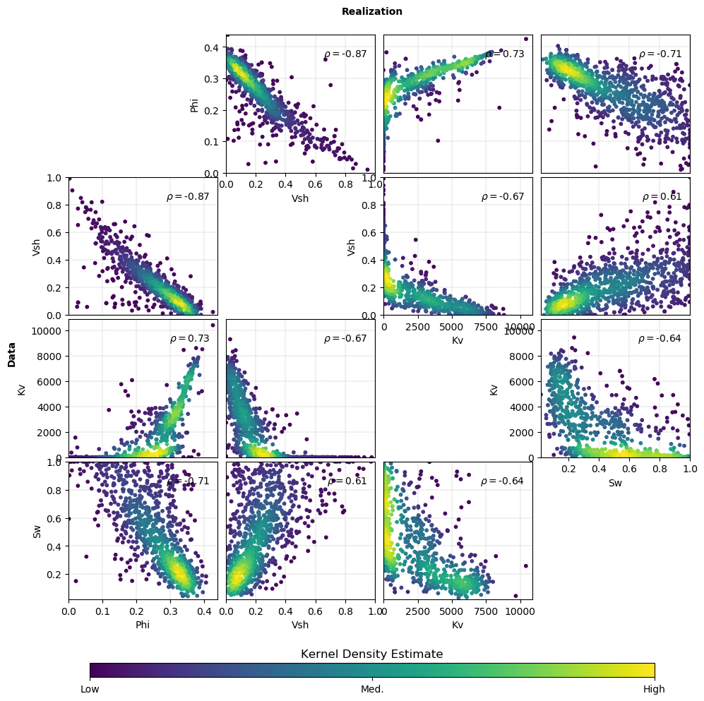
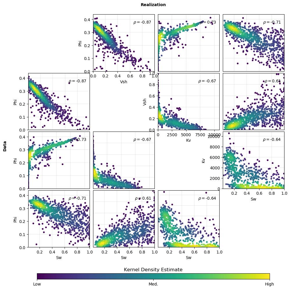
Code author: Ryan Barnett - 2018-03-26
Subplots
-
pygeostat.plotting.subplots.subplots(nrows, ncols, figsize=None, axes_pad=(0.04, 0.4), aspect=True, label_mode='L', cbar_mode=None, cbar_location='right', cbar_pad=0.03, cbar_size='3%', cbar_set_cax=True, share_all=False, fig=None, axes_class=None, rect=111)¶ A wrapper of the Matplotlib ImageGrid class, providing additional ease of use for the following reasons:
- The format of the arguments is modified to mimic the more commonly used matplotlib.pyplot.subplots
- A matplotlib.figure.Figure no longer needs to be initiated seperately
- Kwarg locations and defaults are modified to emphasize more commonly used and modified settings. Rarely used kwargs such as direction and ngrids are removed.
- The involved import statement of ImageGrid is avoided
- Project defaults are integrated via pygeostat.gsParams (future work)
ImageGrid:
“A class that creates a grid of Axes. In matplotlib, the axes location (and size) is specified in the normalized figure coordinates. This may not be ideal for images that needs to be displayed with a given aspect ratio. For example, displaying images of a same size with some fixed padding between them cannot be easily done in matplotlib. ImageGrid is used in such case.”Parameters: - nrows (int) – number of of rows in the grid
- ncols (int) – number of of columns in the grid
Optional keyword arguments (from ImageGrid):
Keyword Default Description axes_pad 0.02 float| pad between axes given in inches or tuple-like of floats, (horizontal padding, vertical padding) aspect True [ True | False ] If True, each the length of the x and y axes are based on their absolute range. Generally used for plots such as maps, but should be False for plots such as variograms. label_mode “L” [ “L” | “1” | “all” ] cbar_mode None [ “each” | “single” | “edge” ] cbar_location “right” [ “left” | “right” | “bottom” | “top” ] cbar_pad None cbar_size “5%” cbar_set_cax True [ True | False ] if True, each axes in the grid has a cax attribute that is bind to associated cbar_axes. share_all False [ True | False ] axes_class None a type object which must be a subclass of axes_grid’s subclass of AxesKeyword Arguments: - figure (matplotlib.figure.Figure) – a figure is created if one is not provided (based on rcParams[‘figure.figsize’] if None)
- figsize (matplotlib.figure.Figure) – size of the figure, if one must be created. Based on rcParams[‘plotting.figsize’] if None
- rect (int) – “[left, bottom, width, height]* (in:class:` ~matplotlib.figure.Figure` coordinates) or the subplot position code (e.g., “121”). The default setting occupies the entire figure.
Returns: mirroring the output of matplotlib.subplots()
Return type: (axes, fig)
See also
Example:
Plot 4 realizations in each panel with a common colorbar.
import pygeostat as gs

# Initialize gs.subplots
fig, axes = gs.subplots(2, 2, figsize=(8, 8), cbar_mode='single')

# Default grid definition
gs.gsParams['data.griddef'] = gs.GridDef('120 5 10\n110 1205 10\n1 0.5 1.0')

# Iterate over the axes/realizations
for i, ax in enumerate(axes):
    sim = gs.ExampleData('grid2d_surf_real'+str(i+1))
    gs.pixelplt(sim, var='Top Elevation', ax=ax, vlim=(375, 385),
                title='Realization '+str(i+1))
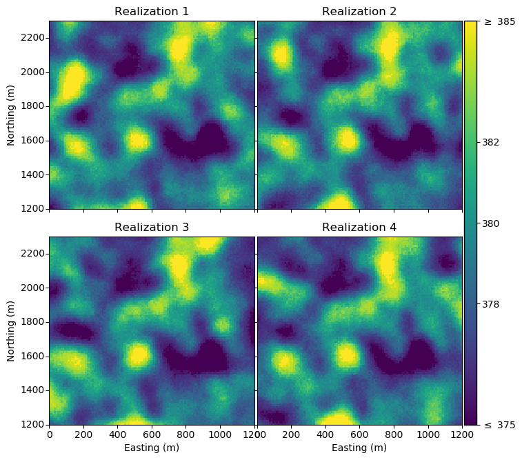
Code author: Ryan M. Barnett, 2018-04-05
Variogram Plot
-
pygeostat.plotting.varplt(data, index=None, sill=1, experimental=True, label=None, ax=None, figsize=None, xlim=None, ylim=None, title=None, xlabel=None, unit=None, ylabel=None, color=None, marker=None, ms=None, ls=None, lw=None, minpairs=40, pairnumbers=False, grid=None, axis_xy=None, pltstyle=None, cust_style=None, outfl=None, out_kws=None, **kwargs)¶ This function uses matplotlib to create a variogram plot. Input dataframe structure is important as the required data is found within columns that have recognizable headers.
The only parameter needed is
dataand must be a pandas dataframe. All other arguments are optional or automatically determined. The settings for experimental and modeled variogram plotting is controlled by theexperimentalparameter.Please review the documentation of the
gs.set_style()andgs.exportimg()functions for details on their parameters so that their use in this function can be understood.Parameters: - data (pd.DataFrame) – Dataframe containing the variogram value, variogram distance, and variogram index (if required) data as columns. The dataframe must contain the correct column IDs. The column header containing the variogram distance can be: ‘h’, ‘Lag Distance’, or ‘Distance.’ The column header containing the variogram values can be: ‘vario’, ‘Variogram Value’, or ‘Variogram’
- index (int) – Point to which variogram you would like to plot if there are multiple variogram within your dataframe. The dataframe must contain the correct column ID. The column header containing the variogram index values can be: ‘Variogram Index’ or ‘Index’
- sill (float) – Value to plot a horizontal line representing the variograms sill
- experimental (bool) – Indicator if the variogram is experimental
Trueor modeledFalse - label (str or bool) – String to pass to Matplotlib’s auto legend function. A default value
will be generated; however, to prevent this, set label to
False - ax (mpl.axis) – Matplotlib axis to plot the figure
- figsize (tuple) – Figure size (width, height)
- xlim (float tuple) – Minimum and maximum limits of data along the x axis
- ylim (float tuple) – Minimum and maximum limits of data along the y axis
- title (str) – Title for the plot
- xlabel (str) – X-axis label
- unit (str) – Distance units used for lag distance. Only used if the keyword parameter
xlabelis left to its default value ofNone. - yalabl (str) – Y-axis label
- color (str) – Any Matplotlib color
- marker (str) – A valid Matplotlib marker style
- ms (float) – Marker size in points
- ls (float) – A valid Matplotlib line style
- lw (float) – Line width in points
- minpairs (int or bool) – Any experimental variogram values that were calculated using fewer
pairs then what is specified by the argument
minpairs, is highlighted red. To turn this functionality off, setminpairstoFalse. - grid (bool) – Plots the major grid lines if True. Based on gsParams[‘plotting.grid’] if None.
- axis_xy (bool) – converts the axis to GSLIB-style axis visibility (only left and bottom visible) if axis_xy is True. Based on gsParams[‘plotting.axis_xy’] if None.
- pltstyle (str) – Use a predefined set of matplotlib plotting parameters as specified by
gs.GridDef. UseFalseorNoneto turn it off - cust_style (dict) – Alter some of the predefined parameters in the
pltstyleselected. - outfl (str) – Output figure file name and location
- out_kws (dict) – Optional dictionary of permissible keyword arguments to pass to
gs.exportimg() - **kwargs – Optional permissible keyword arguments to pass to matplotlib’s plot function
Returns: matplotlib Axes object with the variogram
Return type: ax (ax)
Examples
Lodad the data from output from gslib varcal/varmodel
>>> varcalcdat = gs.DataFile('./examples/data/varcalc.out', readfl=True)
>>> varmodeldat = gs.DataFile('./examples/data/varmodel.out', readfl=True)
A simple call for experimental variograms, plotting only one direction:
>>> gs.varplt(varcalcdat.data, index=1)
A simple call for modeled variograms, plotting only one direction:
>>> gs.varplt(varmodeldat.data, index=1, experimental=False)
Plot both experimental and modeled variograms for one direction:
Note
Some odd behavior may occur if the sill is repeatedly plotted. In the case when variograms are being plotted iteratively on the same figure, set the parameter
silltoFalseon all but the last figure.>>> ax = gs.varplt(varcalcdat.data, index=1, sill=False) >>> gs.varplt(varmodeldat.data, index=1, experimental=False, ax=ax)
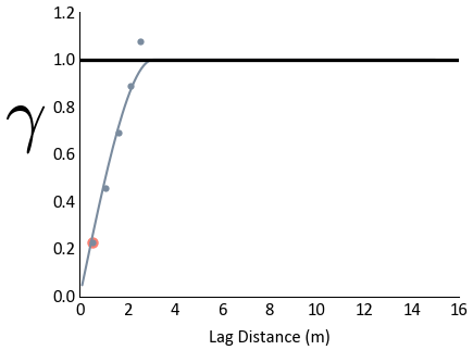
Plot both directions experimental and modeled variograms with a legend, grab 2 colors from
gs.get_palette()to use for the plots, and prevent points calculated using a low amount of pairs from being highlighted for one of the plots:>>> colors = gs.get_palette('cat_dark', 2, cmap=False) >>> ax = gs.varplt(varcalcdat.data, index=1, color=colors[0], minpairs=False, label=False) >>> gs.varplt(varmodeldat.data, index=1, experimental=False, ax=ax, color=colors[0], ... label='Minor') >>> gs.varplt(varcalcdat.data, index=2, ax=ax, color=colors[1], label=False) >>> gs.varplt(varmodeldat.data, index=2, experimental=False, ax=ax, color=colors[1], ... label='Major') >>> plt.legend(loc=4)
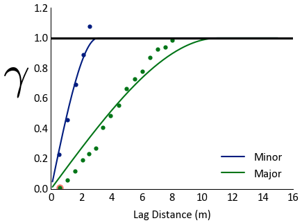
Code author: Jared Deutsch and Warren E. Black - 2015-10-14
Variogram Reproduction Plot
-
pygeostat.plotting.varpltsim(simdat, simvarid, refdat=False, refvarid=1, sill=1, ax=None, figsize=None, xlim=None, ylim=None, trimylim=True, title=None, variable=None, xlabel=None, unit=None, ylabel=None, refclr=None, simclr=None, alpha=None, ls='-', lw=1, lw_real=None, legend_label=None, pltstyle=None, cust_style=None, outfl=None, out_kws=None, **kwargs)¶ Varpltsim provides a means of checking variogram reproduction of simulation realizations to the input variogram model. A variogram reference system is used to know which variograms to plot from a output GSLIB varsim file. Please refer to
gs.get_uniquevarids()for information to understand how it operates.The function uses pygeostats
gs.varplt()to plot both simulation, and if present, reference variograms.The only required parameters are
simdatandsimvarid. The function only acceptssimdatas a pandas dataframe.simvaridis the corresponding ID value derived fromgs.get_uniquevarids(), to the function knows which variograms to plot. All other parameters are optional or have default values. The line width of the simulation plots are hard coded to be half of the size input with thelwparameter.Please review the documentation of the
gs.set_style()andgs.exportimg()functions for details on their parameters so that their use in this function can be understood.Parameters: - simdat (pd.DataFrame) – Dataframe containing the following columns: ‘Variogram Index’, ‘Variogram Number’, ‘Calculation Azimuth’, and ‘Calculation Dip’. Variogram distance data is also needed as must have one of the following column headers: ‘h’, ‘Lag Distance’, or ‘Distance’
- simvarid (int) – A ‘Variogram ID’ derived from
gs.get_uniquevarids() - refdat (pd.DataFrame or bool) – Dataframe containing the reference variogram value,
variogram distance, and variogram index (if required) data as columns. The dataframe
must contain the correct column IDs. The column header containing the variogram
distance can be: ‘h’, ‘Lag Distance’, or ‘Distance.’ The column header containing the
variogram values can be: ‘vario’, ‘Variogram Value’, or ‘Variogram’. If reference data
does not need to be plotted, set
refdattoFalse - refvarid (int) – Point to which reference variogram you would like to plot if there are multiple variogram within your reference dataframe. The dataframe must contain the correct column ID. The column header containing the variogram index values can be: ‘Variogram Index’ or ‘Index’
- sill (float) – Value to plot a horizontal line representing the variograms sill
- ax (mpl.axis) – Matplotlib axis to plot the figure
- figsize (tuple) – Figure size (width, height)
- xlim (float tuple) – Minimum and maximum limits of data along the x axis
- ylim (float tuple) – Minimum and maximum limits of data along the y axis
- trimylim (bool) – Indicate if realization plots should cease plotting once they pass the
limits specified by
ylim. - title (str) – Title for the plot. Can use
dirsfromgs.get_uniquevarids()if direction data is desired in the title. - variable (str) – By default, titles are generated based on the data provided, which include the variable number and direction information. If you would like to keep the direction data but update the variogram name manually, use this parameter to give that variable name
- xlabel (str) – X-axis label
- yalabl (str) – Y-axis label
- unit (str) – Distance units used for lag distance. Only used if the keyword parameter
xlabelis left to its default value ofNone. - refclr (str) – Any Matplotlib color for the reference variogram
- simclr (str) – Any Matplotlib color for the realization variograms
- alpha (float) – Transparency for realization variograms (0 = Transparent, 1 = Opaque)
- ls (float) – A valid Matplotlib line style for both reference and realization variograms
- lw (float) – Line width in points. The width provided in this parameter is used for the reference variogram.
- lw_real (float) – Line width in points. If no value is passed, half the value of
lwis used for the realization variograms - legend_label (str or bool) – A string containing the label that will be attached to the reference variogram if it exists. If the value True is passed, only the realizations will have a label.
- pltstyle (str) – Use a predefined set of matplotlib plotting parameters as specified by
gs.GridDef. UseFalseorNoneto turn it off - cust_style (dict) – Alter some of the predefined parameters in the
pltstyleselected. - outfl (str) – Output figure file name and location
- out_kws (dict) – Optional dictionary of permissible keyword arguments to pass to
gs.exportimg() - **kwargs – Optional permissible keyword arguments to pass to
gs.varplt()and by extension, matplotlib’s plot function if the keyword passed is not used bygs.varplt()
Returns: matplotlib Axes object with the variogram
Return type: ax (ax)
Examples
Import a variogram model manually into python using pygeostat functions:
>>> #Import the reference variogram models into python
>>> var1 = gs.VargModel(vargstr='''3 0
>>> 1 0.46 0 0 0
>>> 16 16 16
>>> 1 0.06 0 0 0
>>> 32 32 32
>>> 1 0.48 0 0 0
>>> 64 64 64''')
>>> #Generate a dataframe that has lag distances values for the above model
>>> model1 = var1.model(azm=0, dip=0, nlags=200, lagdist=0.5, returnstr=False)
Load output from varsim:
>>> varsimdat = gs.DataFile('varsim_reals.out', readfl=True)
Look at what variograms are within the variogram data:
>>> gs.get_uniquevarids(varsimdat.data)
Variogram ID: 1 ... Variable: 1, Azimuth 90, Dip 0
Variogram ID: 2 ... Variable: 2, Azimuth 90, Dip 0
Variogram ID: 3 ... Variable: 3, Azimuth 90, Dip 0
A simple call using the variogram model loaded and the set of realizations associated with Variogram ID 1:
>>> gs.varpltsim(simdat=varsimdat.data, simvarid=1, refdat=model1)
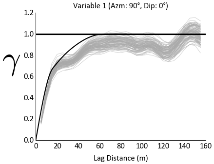
Use a custom variogram title, and fix the x-axis limits:
>>> gs.varpltsim(simdat=varsimdat.data, simvarid=1, refdat=model1, xlim=(0,150),
...              title='PVar1 Variogram Reproduction')
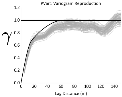
To plot all the variables at once, we first need a dictionary that has model data loaded within it. Create a dictionary using the already loaded model and files generated from varcalc for the other variables:
>>> models={}
>>> models[1] = model1
>>> models[2] = gs.DataFile('varsim_model_var2.out', readfl=True).data
>>> models[3] = gs.DataFile('varsim_model_var3.out', readfl=True).data
Now loop through the variables, use a variable name to update the title produced:
>>> variables=['PVar1', 'PVar2', 'PVar3']
>>> for i in range(1,4):
>>>     var=variables[i-1]
>>>     gs.varpltsim(simdat=varsimdat.data, simvarid=i, refdat=models[i], variable=var,
...                  xlim=(0,150))
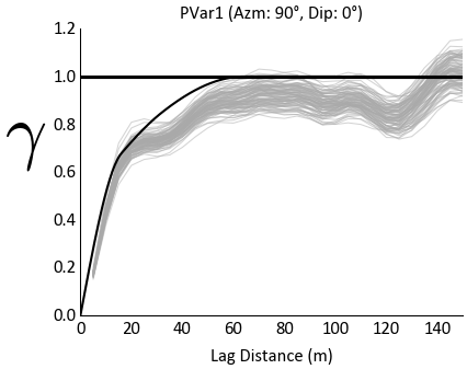
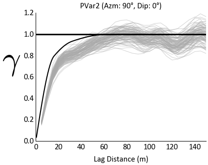
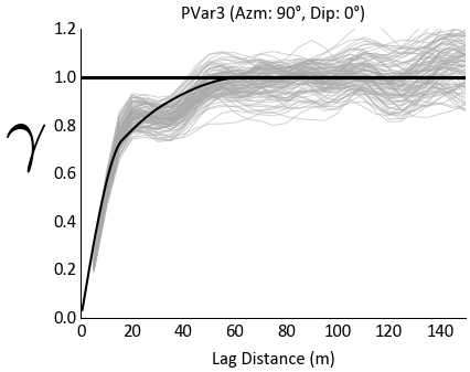
Code author: Warren E. Black - 2015-10-15
Pygeostat Plotting Styles
-
pygeostat.plotting.set_style(style=None, custom=None)¶ The predefined styles were optimized for PNG and EPS figures for use within reports. They may appear strange on their own, but should make sense within reports. Figures should be adjusted based on their appearance within their final location.
A base style
ccgpaperis available and is the default style used by pygeostat. Variants of it are available, which provide different font sizes. All text within figures generated usingccgpaperare 8 points. The stylespt9,pt10,pt11, andpt12are available. As there are multiple rcParams that control the size of the text, these help change the font size with one parameter change.To see which styles are available, the command
gs.avail_stylescan be called.Note
This function is typically embedded within the plotting utilities, this documentation is to help understand parameters being used to call it.
Parameters: - style (str) – Load one the predefined styles outlined above.
- custom (dict) – A dictionary containing matplotlib rc parameters to replace the
aforementioned predefined styles. Only works if a style value is selected. If you don’t
want to modify one the predefined styles, set the figures style to
Falseand set the rcparams yourself.
Examples
A simple call using one of the predefined styles:
>>> gs.set_style(style='ccgpaper')
List which styles are available through pygeostat
>>> gs.avail_styles
... ['pt12', 'pt11', 'pt9', 'pt10', 'ccgpaper']
Use a font size of 9 points by using the
pt9style saved within pygeostat. Also pass some custom rcParams as a dictionary to update thept9style, changing the font and grid line width.>>> gs.set_style(style='pt9', custom={'font.family': 'Times New Roman', ... 'grid.linewidth': 0.25})
Plotting Utility Functions
Variogram Plotting Utils
One of the challenges with variogram plotting is handling the output variogram information from varcalc, varmodel, and varsim. While output from varmodel can only contain multiple directions, varcalc and varsim output can also contain multiple variables. This makes it difficult to collect the right information for plotting.
The utility function gs.get_uniquevarids()
can be used with both plotting functions gs.varplt() and
gs.varpltsim() as a means of determining what
variograms exist within datafiles as well creating a set of variogram IDs that can be called upon.
Examples of its usage is shown throughout the aforementioned functions documentation.
Get Unique Variograms
-
pygeostat.plotting.varutils.get_uniquevarids(data, mode='print', source=None)¶ Enumerate the unique variograms within a output gslib variogram files based on the number of directions and variables found. Prints the unique variograms found to the screen so a varid can be determined for
gs.varplt()orgs.varpltsim(). Alternatively, a dictionary containing the Variogram IDs and their corresponding ‘Variogram Index’ values and a list containing the directions found can be returned.Files from varcalc, varmodel, and varsim are accepted.
Parameters: - data (pd.DataFrame) – Dataframe containing the output data from gslib variogram programs. The columns ‘Variogram Index’, ‘Variogram Number’, ‘Calculation Azimuth’, and ‘Calculation Dip’ must be unedited; specifically their headers.
- mode (str) – Specify the required output from the function. If
'print'is passed, the enumerated variogram IDs will be printed with their corresponding variable and direction information. If'ref'is passed, a dictionary is build for each variogram ID containing their corresponding ‘Variogram Index’ values and a direction list``dirs``. source (str): Manually set what the data source is. Permissible input is:'varcalc','varmodel', and'varsim'.
Returns: Returned if
modeis set to'ref'. A dictionary is build containing each variogram ID and their corresponding ‘Variogram Index’ value or values if multiple realizations are found.Return type: varids (dict)
Returns: Returned if
modeis set to'ref'. A list of directions found within the variogram dataReturn type: dirs (list)
Examples
Load variogram output into python:
>>> varsimdat = gs.DataFile('varsim_reals.out', readfl=True)
Check the variogram IDs that will be used by varpltsim:
>>> gs.get_uniquevarids(varsimdat.data)
    Variogram ID: 1 ... Variable: 1, Azimuth 90, Dip 0
    Variogram ID: 2 ... Variable: 2, Azimuth 90, Dip 0
    Variogram ID: 3 ... Variable: 3, Azimuth 90, Dip 0
Return the varids and print the index values attached to each Variogram ID:
>>> varids, dirs = gs.get_uniquevarids(varsimdat.data, mode='ref')
>>> print(varids[1])
[1, 4, 7, ..., 292, 295, 298]
The list
varidscan now be used to repeadidly plotgs.varplt(), which is whatgs.varpltsim()does.Have a look at the list
dirswhich was generated above:>>> print(dirs) [(90, 0)]
The output
dirscan be useful in situations such as generating plot titles.Code author: Warren E. Black - 2015-10-14
Trim Experimental Variogram
-
pygeostat.plotting.varutils.trimylim(simdat, ylim)¶ Remove realization experimental variogram points beyond a variogram value so they won’t be plotted.
Parameters: - simdat (pd.DataFrame) –
- ylim (float) – Value to trim points after
Code author: Warren E. Black - 2016-05-31
Add Scale-bar
-
pygeostat.plotting.utils.scalebar(x, y, scale, length, ax, img, height=0.005, units='km', pad=0.02)¶ A small utility function called from many of the plotting functions. This will Add a scale bar to a plot. Requires an Image object such as imshow.
Parameters: - x (float) – X coordinate of the scale bar in figure space
- y (float) – Y coordinate of the scale bar in figure space
- scale (float) – Side of each pixel in the units specified by the parameter
units - length (float) – Length of the scale bar in the units specified by the parameter
units - ax (mpl.ax) – Matplotlib axis to plot the scale bar onto
- img (mpl.AxesImage) – Matplotlib AxesImage object. Produced by from imshow()
- height (float) – Height of the scale bar as a percentage of plot in y direction in figure space
- units (str) – Units of the scale bar
- pad (float) – Padding between the scale bar and the annotation
Code author: Warren E. Black - 2016-06-13
Add X-tick Labels on ImageGrid
-
pygeostat.plotting.utils.addxticks(fig, nrow, ncol, lastax, axextents=None)¶ A small utility function called from many of the plotting functions. This adds xticklabels to the last subplot in a column when it is not in the last row.
Code author: Ryan Martin and Warren E. Black - 2016-04-18
Annotate Scatter Plot
-
pygeostat.plotting.utils.smart_annotate(ax, x, y, labels, k=0.002)¶ A small utility function that can be called from a plotting funtion. This annotates a scatter plot and moves the annotations around so they do not overlap. Works okay…
Will need to be made more flexible in the future. Works for gs.mdsplt() at the moment.
Retrieved and modified from: http://stackoverflow.com/a/34697108
Parameters: - ax (mpl.axis) – Matplotlib axis object the scatter plot is plotted on
- x – 1-D array with the x-coordinates used for the data in the scatter plot
- y – 1-D array with the y-coordinates used from the data in the scatter plot
- labels (list) – Labels to annotate the scatter plot with
- k (float) – Scalar for the distance from the data the annotation is placed
Code author: Warren E. Black - 2016-05-30
Apply Number of Ticks to Axis
-
pygeostat.plotting.utils.applytickbins(ax, ntickbins=None)¶ Quick function to deal with tuple or integer input
Parameters: - ax (mpl.axes) – the axis to apply the tickbins too
- ntickbins (int, tuple) – either an int (applied to both) or tuple for x and y respectively
Clear Plotting Memory Leaks
-
pygeostat.plotting.utils.clrmplmem()¶ Clear the current plot from memory.
When looping the generation of plots, matplotlib does not remove data from memory until it is needed, even if the namespace used is repeated. Instead of clearing the data, the namespace is simply remaped. This function uses a series of commands that will dump physical memory.
Example:
>>> for var in variables:
>>>     gs.pixelplt(data[var], griddef=griddef)
>>>     gs.clrmplmem()
Code author: Warren E. Black - 2016-03-22
Format Subplot Axis
-
pygeostat.plotting.utils.format_subplot_axis(fig, ax, plotformat_dict, cbar=None)¶ A small utility function that will allow you to pass a dictionary for formatting such things as the fontsize and color of subplot axis
Parameters: - fig (matplotlib.fig) – the figure for the subplots
- ax (matplotlib.ax) – the matplotlib axis for the subplots
- cbar (matplotlib.fig) – the cbar figure used in pygeostat plotting functions
- plotformat_dict (dict) – dictionary used to format the axis
Returns: fig, ax fig, ax, cbar
Dictionary Keys:
‘fontsize’: Dictionary
- ‘title’ (int): change title fontsize
- ‘cbar_title’ (int): change cbar title fontsize
- ‘xaxis_lable’ (int): change xaxis label fontsize
- ‘xaxis_ticklabels’ (int): change xaxis tick labels fontsize
- ‘yaxis_label’ (int): change yaxis label fontsize
- ‘yaxis_ticklabels’ (int): change taxis tick labels fontsize
- ‘cbar_ticklabels’ (int): change cbar tick labels fontsize
‘color’: Dictionary
- ‘title’ (str): change title fontsize
- ‘cbar_title’ (str): change cbar title fontsize
- ‘xaxis_lable’ (str): change xaxis label fontsize
- ‘xaxis_ticklabels’ (str): change xaxis tick labels fontsize
- ‘yaxis_label’ (str): change yaxis label fontsize
- ‘yaxis_ticklabels’ (str): change taxis tick labels fontsize
- ‘cbar_ticklabels’ (str): change cbar tick labels fontsize
Code author: Tyler Acorn - Jan 03, 2018
Format Plot
-
pygeostat.plotting.utils.formatplt(ax, xlabel=None, ylabel=None, title=None, grid=None, axis_xy=None, xlim=None, ylim=None)¶ Format a plot with common properties such as labels and grid/axis visibility. Not used by the spatial plotting function.
Parameters: ax (Matplotlib axis handle) – axis handle to modify
Keyword Arguments: - xlabel (str) – label of the x-axis
- ylabel (str) – label of the y-axis
- title (str) – plot title
- grid (bool) – plots the major grid lines if True. Based on gsParams[‘plotting.grid’] if None.
- axis_xy (bool) – converts the axis to GSLIB-style axis visibility (only left and bottom visible) if axis_xy is True. Based on gsParams[‘plotting.axis_xy’] if None.
- xlim (tuple) – set x-axis limits to xlim[0] and xlim[1]
- ylim (tuple) – set y-axis limits to ylim[0] and ylim[1]
Returns: modified axis handle
Return type: ax(Matplotlib axis handle)
Get a Colormap
-
pygeostat.plotting.utils.get_cmap(colormap)¶ Return a colormap that is saved within pygeostat. Available colormaps are
topo1, andtopo1. These colormaps are used for hillshading.Parameters: colormap (str) – Desired colormap Returns: Matplotlib colormap Return type: cmap (cmap) Examples
To get a list of colormaps within pygeostat in python, call the following function:
>>> gs.cmaps.avail_cmaps
Code author: Warren E. Black - 2015-10-08
Get Continous Colorbar Values
-
pygeostat.plotting.utils.get_contcbarargs(data, sigfigs, vlim=None, nticks=5, catdata=None)¶ A small utility function called from many of the plotting functions. This determines logical continuous colorbar arguments if value limit values are not provided. If they are, determine some intermediate values.
Parameters: - data – A numpy array containing the data that is being plotted and required a colorbar
- sigfigs (int) – The number of significant figures to consider
- vlim (float tuple) – Value limits of the data being plotted as a tuple (vmin, vmax)
- nticks (int) – The number of tick labels that need to be generated
- catdata (bool) – Basically assume the codes are integers
Returns: - vlim (float tuple) – A tuple of the new limits to use for plotting
- ticklocs (list) – A list of tick locations for the colorbar
- ticklabels (list) – A list of tick labels for each tickloc value
Code author: Warren E. Black - 2015-09-30
Get a Palette
-
pygeostat.plotting.utils.get_palette(palette, ncat, cmap=True)¶ Return a colour palette with the required number of colours. The available palettes are
cat_pastel,cat_vibrant, andcat_dark. Please refer to the colour palette documentation for more information.The returned data can be either a list of colours or a Matplotlib ListColormap object.
Parameters: - palette (str) – Desired colour palette
- ncat (int) – The number of categories being plotted
- cmap (bool) – Indicate if the retruned pallet is a list of colors or a Matplotlib ListColormap
Returns: palette – if
cmapisTrueor a list ifcmapisFalsewith the required number of coloursReturn type: Matplotlib colormap, list
Examples
To get a list of colour palettes within pygeostat in python, call the following function:
>>> gs.cmaps.avail_palettes
Code author: Warren E. Black - 2015-10-08
Get a Label from pd Sources
-
pygeostat.plotting.utils.getlabel(data)¶ Small utility to grab label infromation from different types of data sources
Parameters: data – Tidy (long-form) dataframe where each column is a variable and each row is an observation. Pandas dataframe or numpy array Returns: the name of the column Return type: label (str) Code author: Warren E. Black
Get Logical Min/Max Values
-
pygeostat.plotting.utils.getminmax(vlim, sigfigs)¶ A small utility function called from many of the plotting functions. This determines some logical minimum and maximum values to bound a dataset based on a specified number of significant figures.
Parameters: - vlim (float tuple) – Minimum and maximum values to honor if parameter of “None” is not passed (vmin, vmax)
- sigfigs (int) – Number of significant figures to consider
Returns: Calculated logical (min, max) bounds
Return type: valrng (float tuple)
Code author: Warren E. Black - 2015-10-13
Get Coordinates for Superaxis Label
-
pygeostat.plotting.utils.get_supaxislocs(fig, nrow, ncol, figsize, pad)¶ A small utility function called from many of the plotting functions. This gets the required coordinates for super axis labels.
Parameters: - fig (mpl.fig) – Matplotlib figure
- nrow (int) – Number of rows
- ncol (int) – Number of Columns
- figsize (tuple) – Figure size (width, height)
- pad (float) – Separation between items and the output coordinates
Returns: - xmin (float) – Minimum coordinate of figure in x-axis
- xmid (float) – Center coordinate of figure in x-axis
- ymin (float) – Minimum coordinate of figure in y-axis
- ymid (float) – Center coordinate of figure in y-axis
- ymax (float) – Maximum coordinate of figure in y-axis
Code author: Ryan Martin and Warren E. Black - 2016-04-18
Palette from Continuous Colormap
-
pygeostat.plotting.utils.catcmapfromcontinuous(contcmap, ncats, offset=0.5)¶ Use the continuous colormap to get a set of categorical values returned in the proper format for the other plotting routines in pygeostat from ListedColormap()
Parameters: - contcmap (str) – valid matplotlib continuous colormap string, like ‘jet’ or ‘spectral’
- ncats (int) – number of categories passed to the function
- offset (float) – offsets the colors so as they are not the end member colors
Returns: Matplotlib colormap
Return type: cmap (cmap)
Code author: Ryan Martin - 2016-05-18
Restore Matplotlib Plotting Style
-
pygeostat.plotting.set_style.restore_mpl_style()¶ Restore the matplotlib defaults for this session .. codeauthor:: Ryan Martin - 16-03-2018
Set-up Figure Utility
-
pygeostat.plotting.utils.setup_plot(ax, cbar=None, figsize=None, cax=None)¶ A small utility function called from many of the plotting functions. This will set up a matplotlib plot instance based on whether an axis is passed or not.
Parameters: - ax (mpl.axis) – Matplotlib axis to plot the figure
- cbar (bool) – Indicate if a colorbar should be plotted or not
- figsize (tuple) – Figure size (width, height)
- cax – Matplotlib.ImageGrid.cbar_axes object
Returns: Matplotlib figure ax (mpl.axis): Matplotlib axis to plot the figure cax: Matplotlib.ImageGrid.cbar_axes object
Return type: fig (mpl.plt.fig)
Statistics Block Utility
-
pygeostat.plotting.utils.get_statblk(stat_blk, statsets, statlist, stat_xy)¶ A small utility function called from many of the plotting functions. Extracts the required statistics and return a string to plot and alignment settings.
If automatic alignment is not desired, pass the string
'noalign'throughstat_blk.Note done
Returns: txtstats, stat_xy, ha, va Code author: Warren E. Black - 2016-07-22
Subplot Clean
-
pygeostat.plotting.subplots.subplots_clean(axes, nused, ncols=None)¶ Remove unused axes. Add labels where space is made available due to the removed axes.
Parameters: - axes (list of axes from gs.subplots or plt.subplots) – where the number of axes exceeds the number used (nused)
- nused (int) – number of used axes, where it assumed that axes[:nused] are used.
- ncols (int) – number of of columns in the grid, which is required to add labels.
Super Axis Label
-
pygeostat.plotting.utils.supaxislabel(axis, label, rotation=None, label_prop=None, labelpad=0, ha='center', va='center', fig=None)¶ A small utility function called from many of the plotting functions. This adds super ylabel or xlabel to the figure similar to mpl.suptitle when using subplots. From: http://stackoverflow.com/a/29107972
Parameters: - axis (str) – Indicator as to which axis to place a label. Allows ‘x’ or ‘y’ as parameters
- label (str) – Label to place on the selected axis
- label_prop – Keyword dictionary to be set to plt.text
- labelpad (float) – Padding from the axis (default: 0)
- ha (str) – horizontal alignment (default: ‘center’)
- va (str) – vertical alignment (default: ‘center’)
Code author: Warren E. Black - 2015-09-30
Title Overlap Check
-
pygeostat.plotting.utils.titleoverlap(ax, title)¶ A small utility function called from many of the plotting functions. This returns a boolean if the title overlaps with x-axis tick labels that have been placed on the top spline.
Parameters: - ax (ax) – A matplotlib axis object with x axis tick labels
- title (text object) – A text object created by plt.title(), plt.suptitle(), or plt.text() (e.g., titletxt = plt.suptitle(‘Title’, y=0.98))
Returns: Indicator if the x-axis tick labels overlap the plot title.
Return type: overlap (bool)
Code author: Warren E. Black - 2015-10-07